TL;DR

We redesigned the Site App to streamline daily operations for research coordinators and principal investigators running clinical trials. Through user-driven research, iterative testing, and focused MVP scoping, we significantly enhanced efficiency, usability, and user satisfaction — achieving a 92% median task completion rate, a System Usability Score (SUS) of 93, and a Net Promoter Score (NPS) of +56.

Introduction

Overview

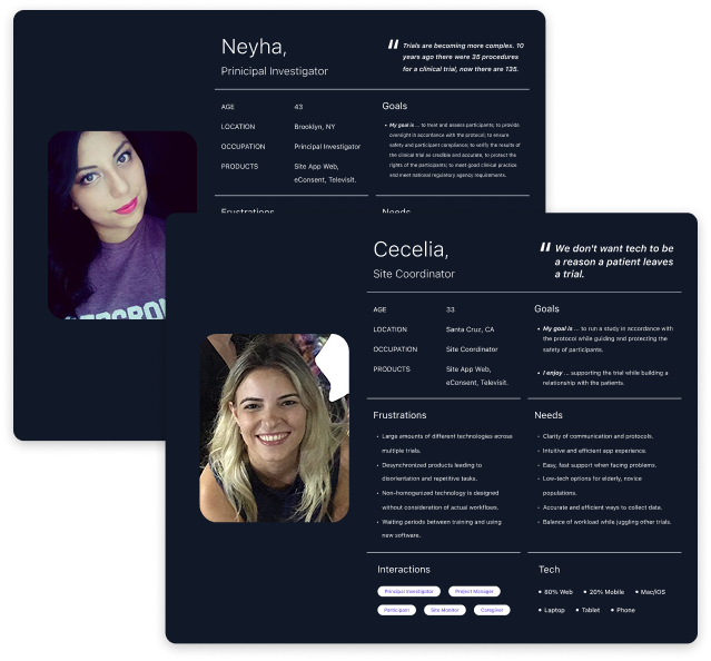
Medable is a platform for decentralized clinical trials—designed to make research faster, more inclusive, and more efficient. One of my key initiatives there was leading the redesign of the Site App: the core product used by research staff to manage clinical studies from start to finish. The Site App hadn’t seen major UX or feature improvements in years. Meanwhile, studies were growing more complex, and users were forced to rely on clunky workarounds. The result? Slower study execution, more support tickets, and frustrated site staff.

This wasn’t just a design refresh—it was a chance to meaningfully improve how studies get run.

My Role

I led end-to-end product design for the Site App redesign, partnering closely with a focused team: a PM, UX researcher, several engineers, and Solutions Consultants embedded with real sites and sponsors. We worked on a fast-moving 8-week timeline, aligned with a major study launch. I drove design a sprint ahead of devs, led a cross-functional discovery kickoff, and made smart trade-offs to keep momentum high without sacrificing quality.

Research

Foundational insights

Before launching new research, our UX researcher and I audited every existing insight we could find—even surfacing past research that hadn’t been reviewed in years. This gave us a strong starting point to identify gaps and sharpen our focus.

  • Early Hypothesis: Site users lacked visibility and control—particularly around participant management and study progress.

Methodologies

With this hypothesis in mind, we conducted focused qualitative research including interviews, surveys, and usability tests. We engaged site users across a range of experience levels, understanding that pain points differ for new users versus seasoned coordinators.

To move quickly, we prioritized speed and efficiency: scheduling sessions promptly, using existing tooling, and documenting feedback in a centralized, accessible research repository that the team could digest in real time.

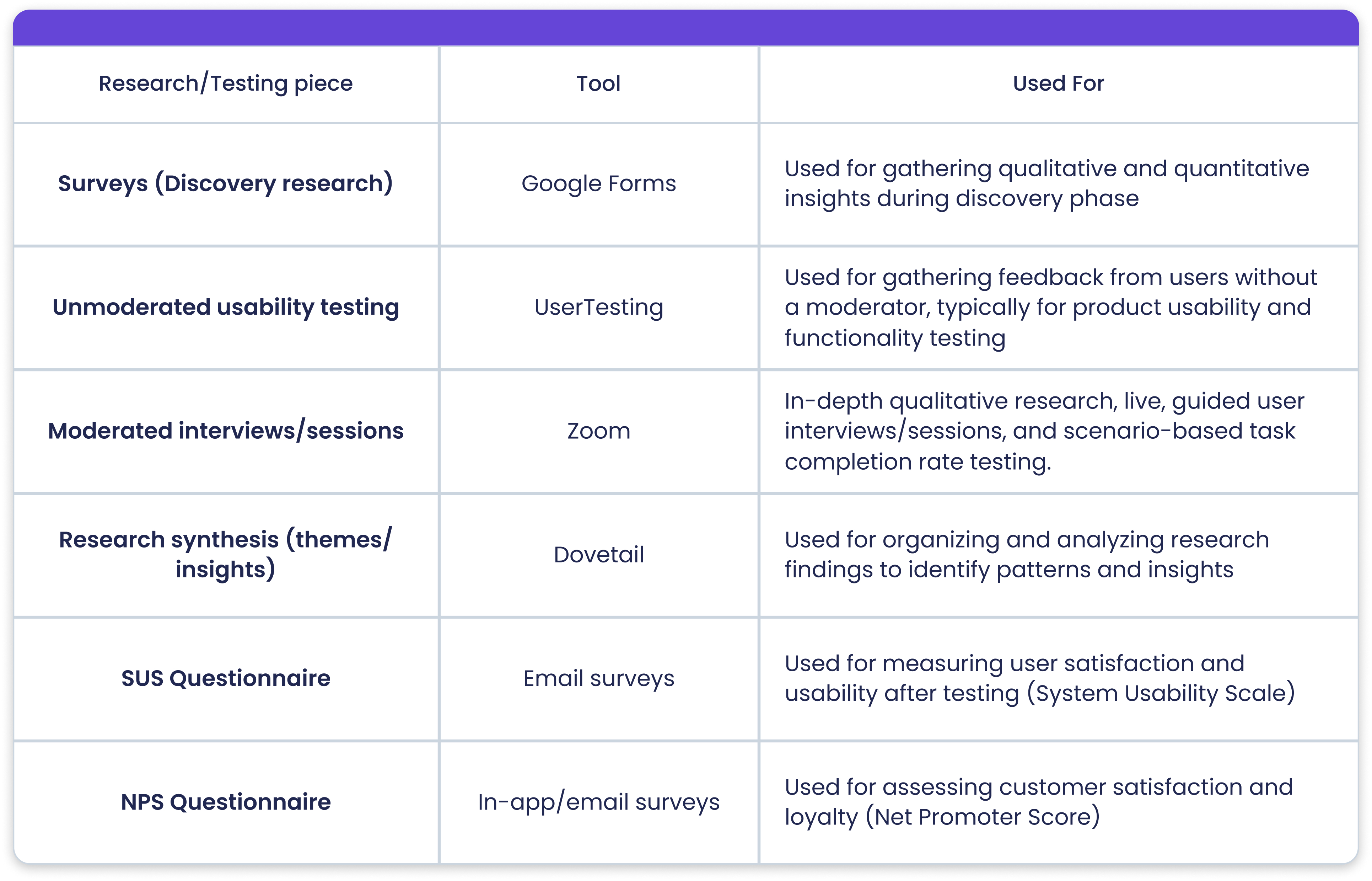
Interviews & surveys

We combined qualitative and quantitative methods — including surveys and interviews with site users — to identify key pain points, understand current workflows, and uncover opportunities for improving the Site App experience.

Key learnings revealed a need for high-visibility insights into study progress and participant status, along with an improved user experience that includes clearer information and contextual helper text to guide users through tasks more efficiently.

Affinity mapping

After collecting data, I thoroughly reviewed all recordings and notes to identify recurring patterns and meaningful insights. Using affinity mapping, I grouped responses to uncover core themes and areas of opportunity—providing structure to the synthesis process and helping guide next steps.

Personas

To anchor design decisions in real user needs, I developed two personas grounded in interview and survey data. These personas captured users’ goals, frustrations, and workflows—helping the team stay aligned on who we were designing for and why. This ensured our solutions were not only user-informed but user-centered.

Define & ideation

Product priorities

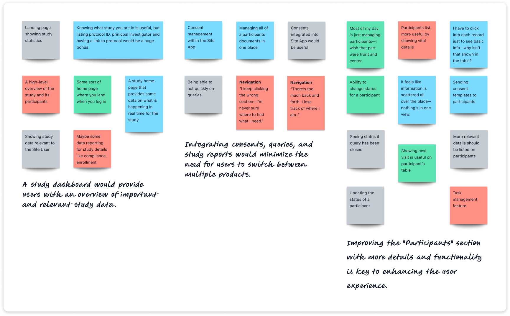
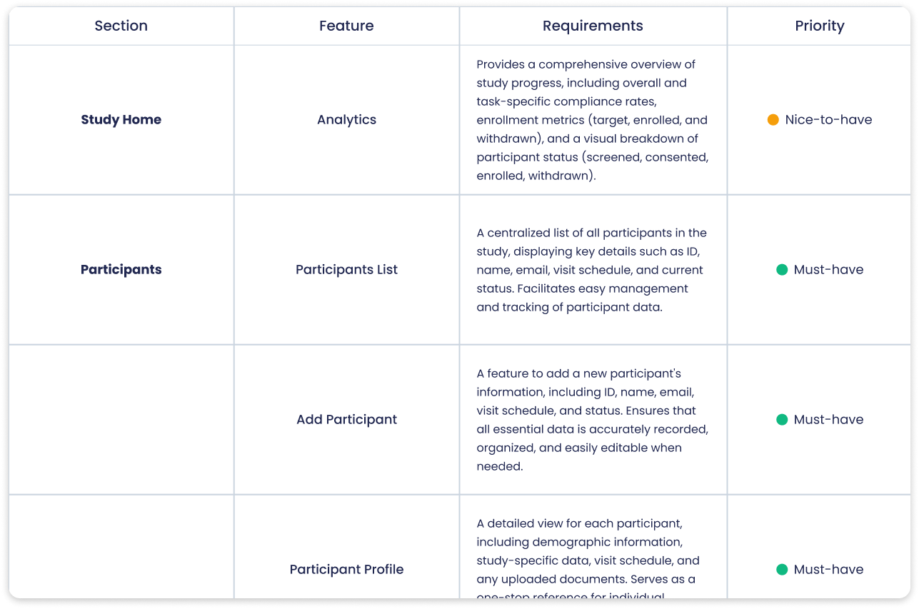
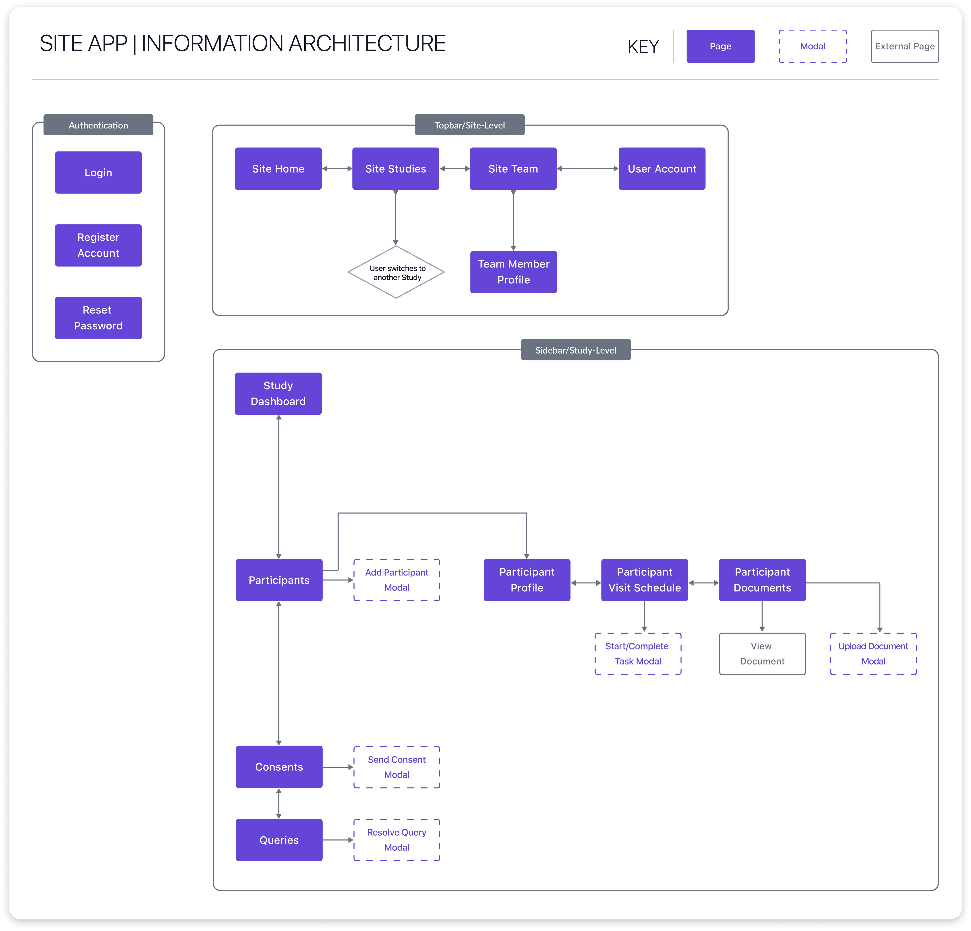
Defined the MVP scope by consolidating existing features and leveraging research insights to identify new functionalities that would significantly improve the Site App experience.

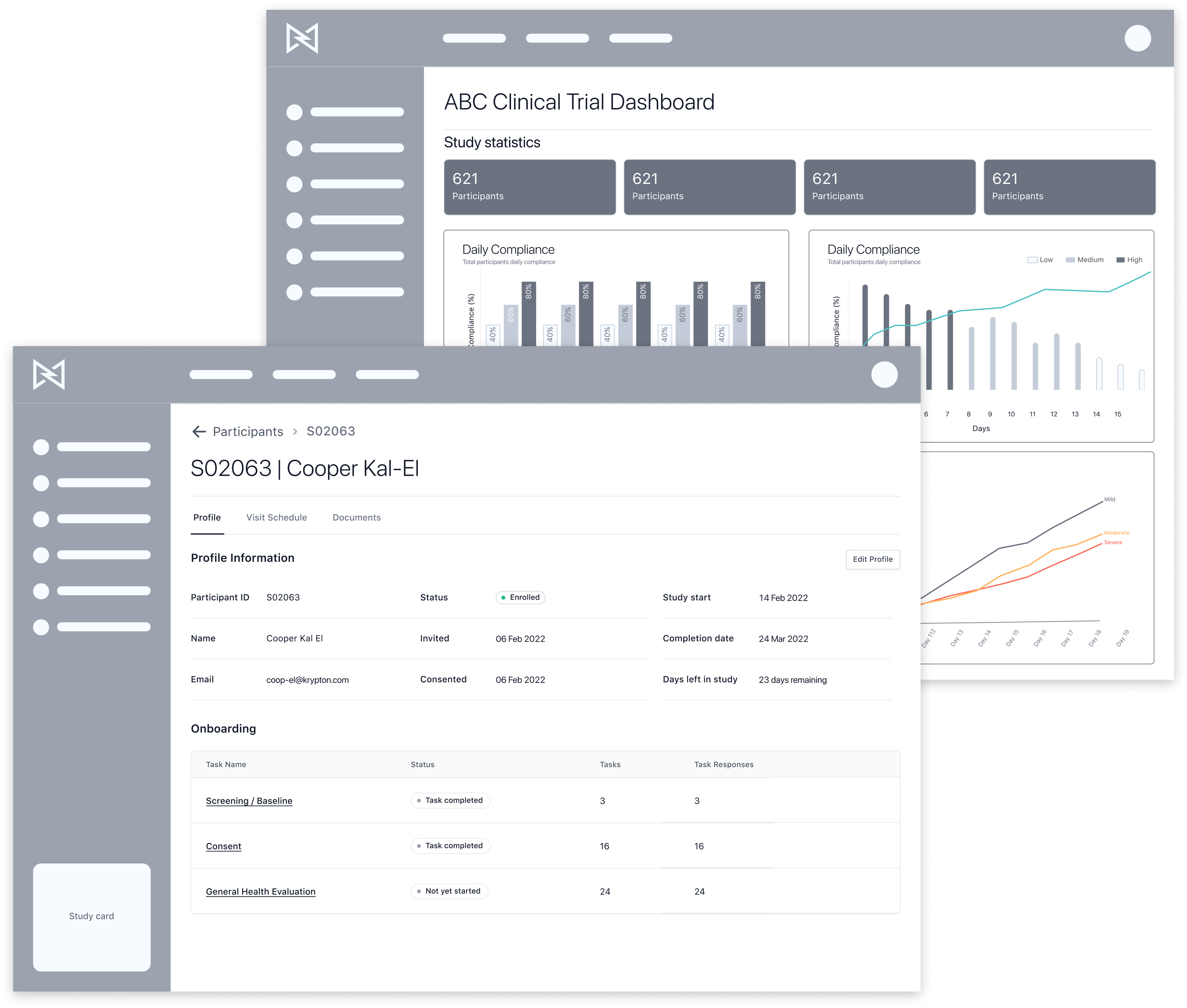
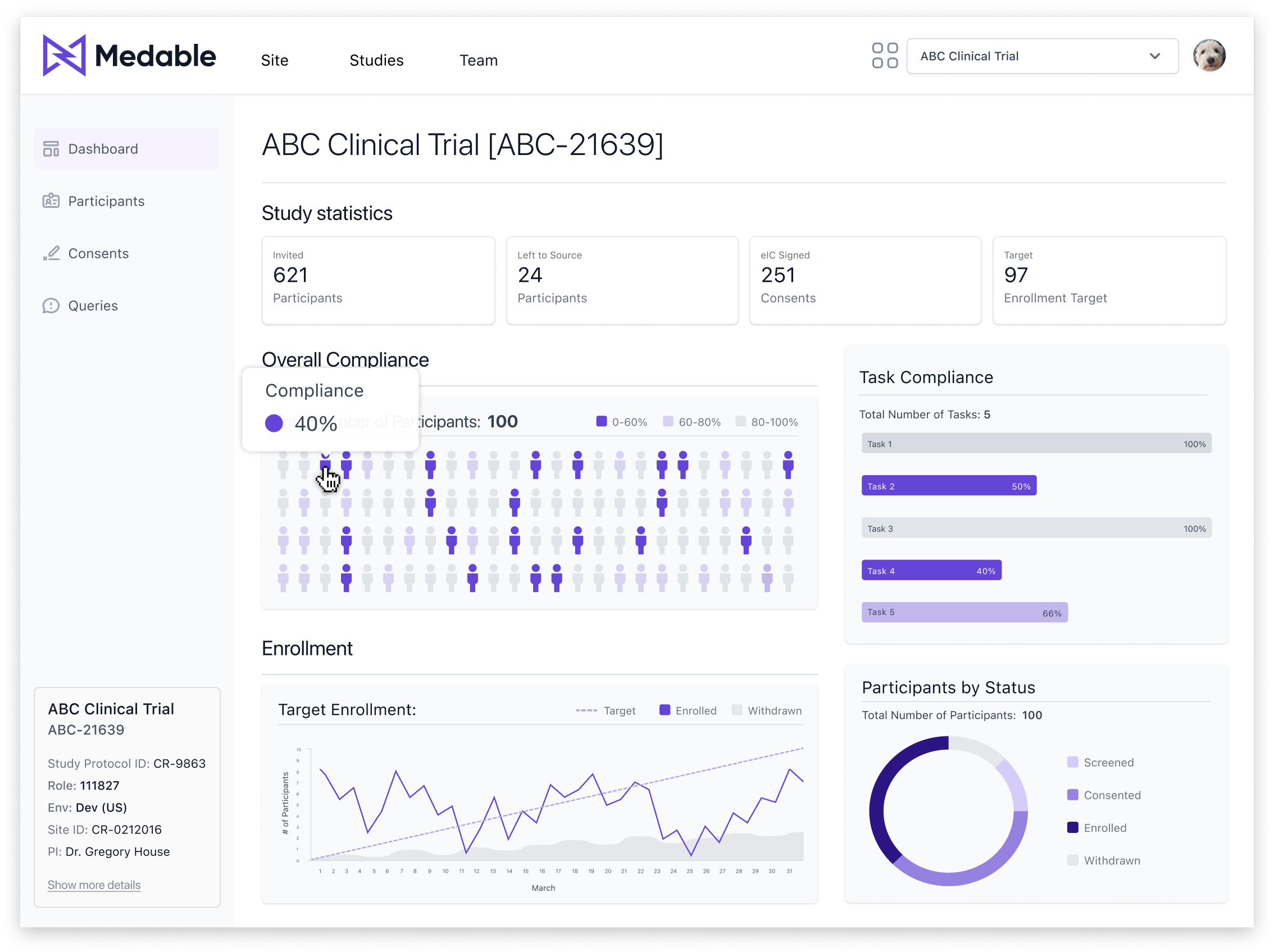
  • A dashboard to display study performance, metrics, and visualizations of essential study data.
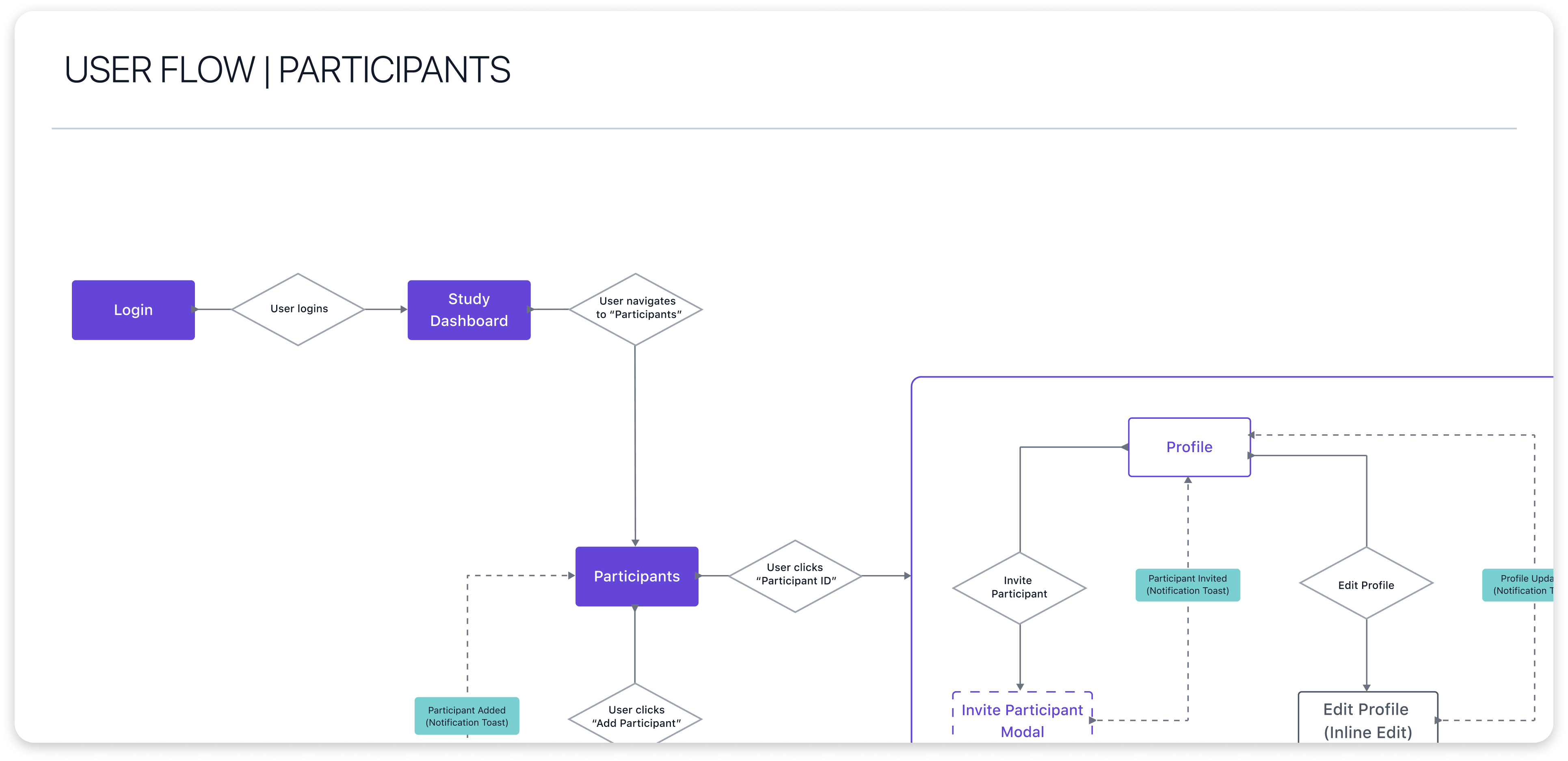
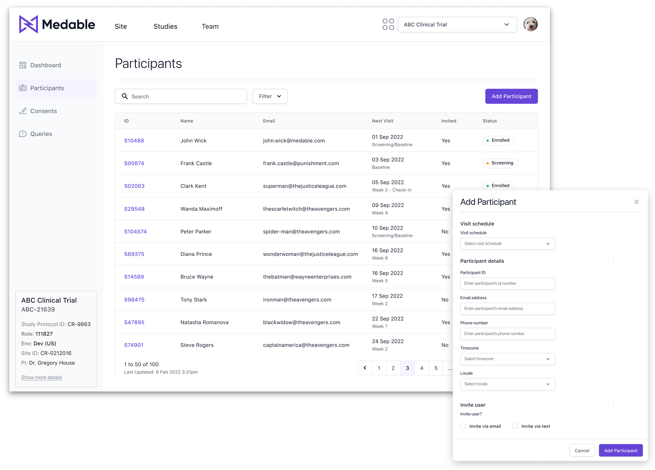
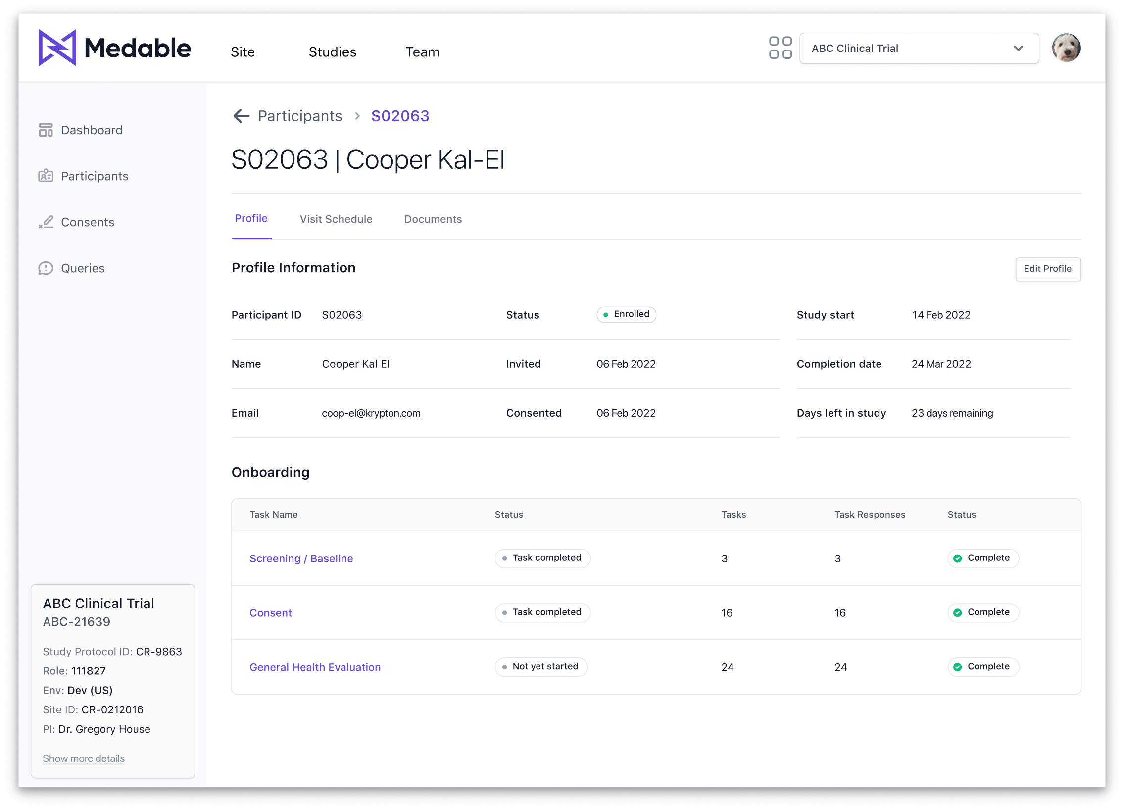
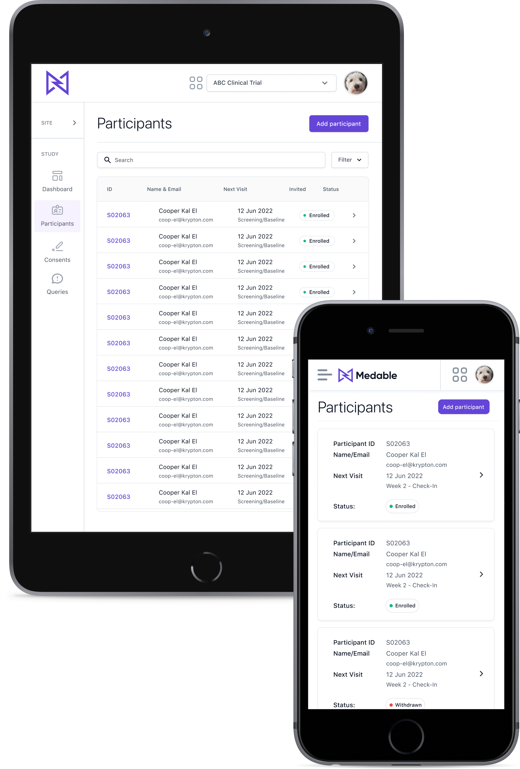
  • Overhauling the "Participants" feature to provide site users with more relevant data, including a comprehensive participant profile.
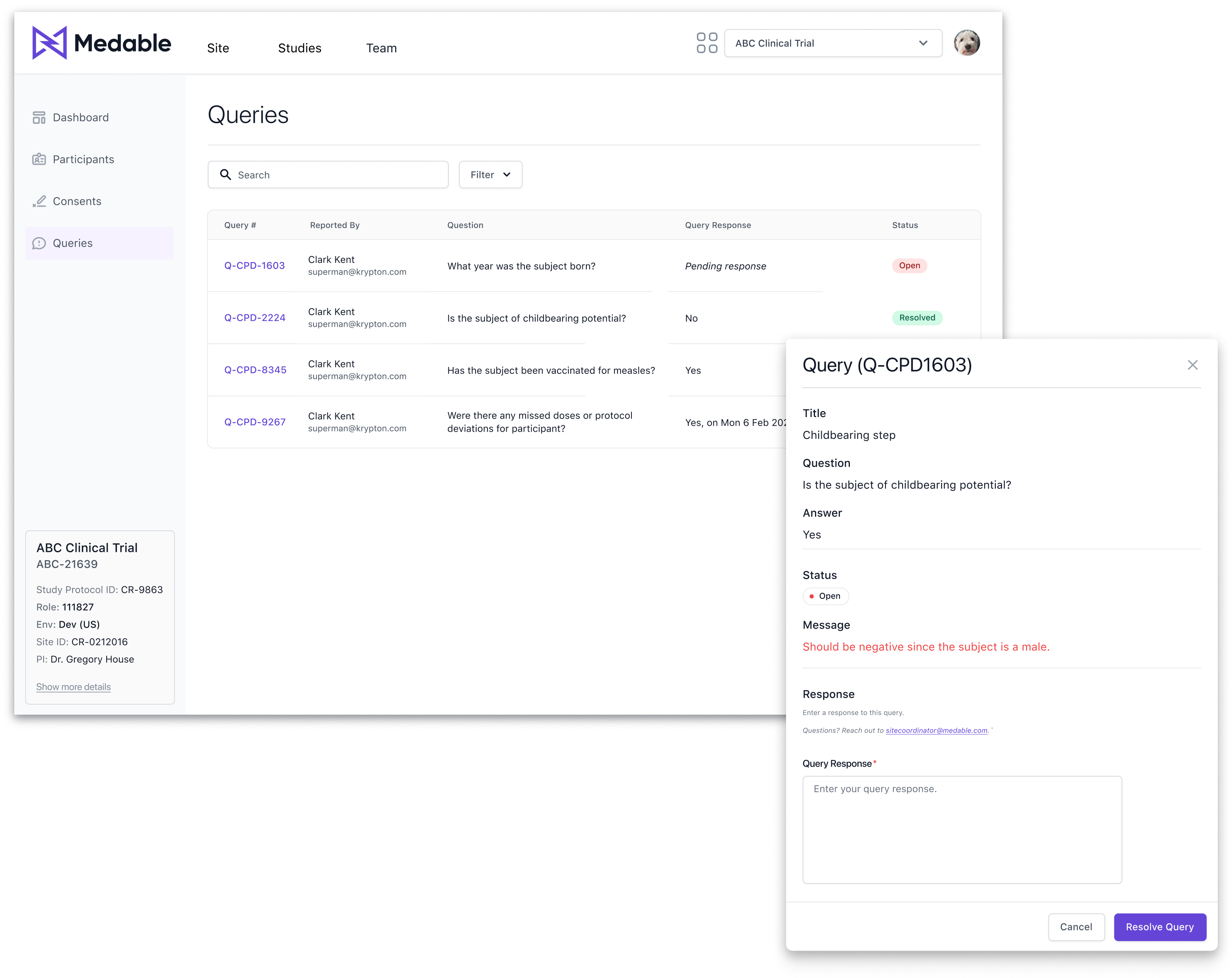
  • Integrating consents and queries within the Site App.
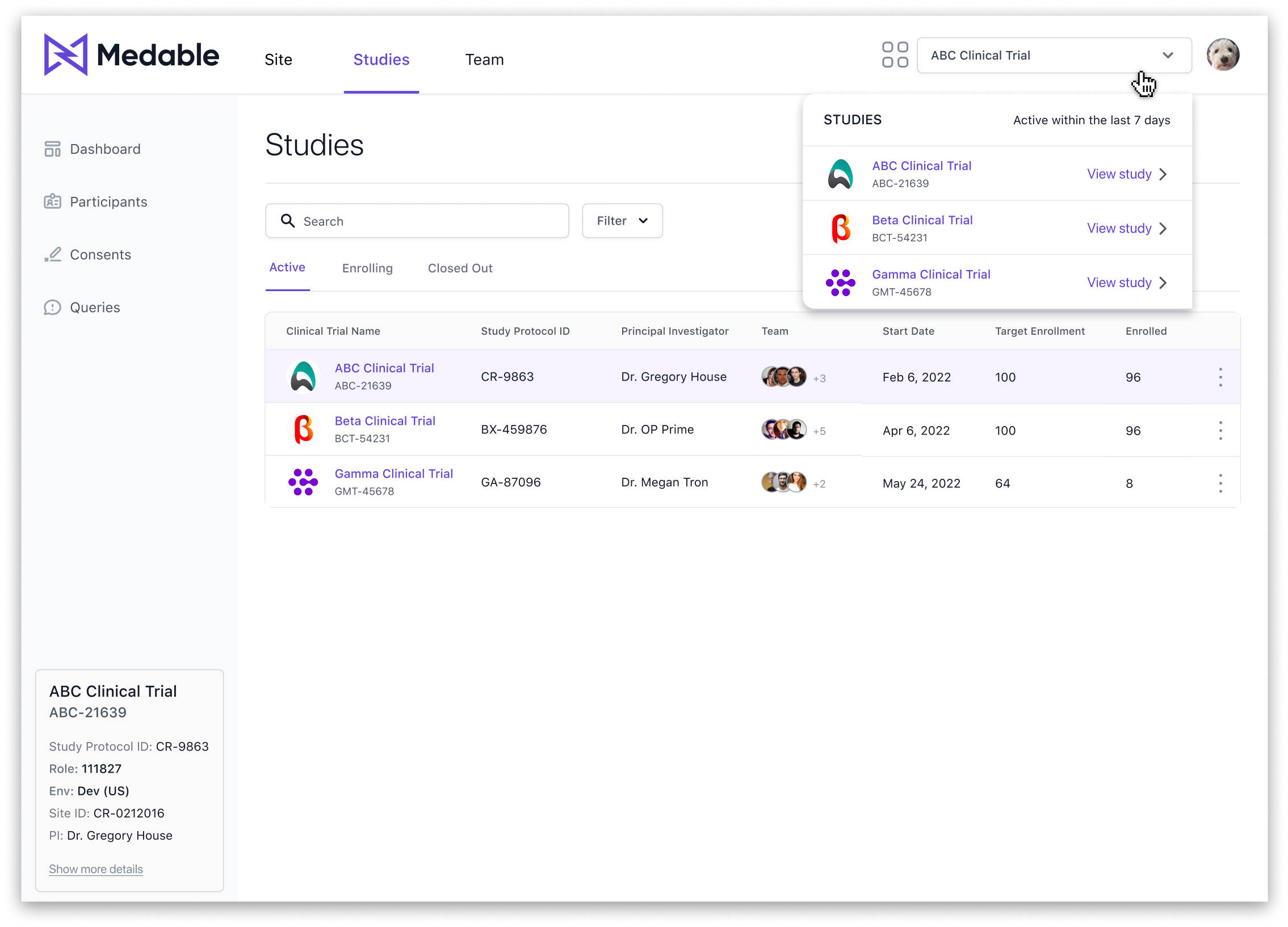
  • Enabling site users to quickly switch between study instances.

Feature requirements

After defining the MVP scope, we prioritized features to ensure an effective roadmap by categorizing them into must-haves—essential, high-impact functionalities necessary for success—and nice-to-haves, which enhance product effectiveness but can be deferred to later versions if time constraints arise.

Information architecture

To create a more user-friendly and efficient Site App, we developed an intuitive, scalable information architecture. Its three-level structure—Authentication, Topbar (Site-Level), and Sidebar (Study-Level)—ensures seamless navigation and supports efficient task completion.

By defining this structure early on, we established a clear foundation that not only guided the design process but also allowed for scalability as new features were introduced.

Visual representation of the three-tiered Information Architecture for improved navigation and scalability.
The primary user flow illustrates the process of interacting with a list of participants and their individual profiles.

User flows

User flows played a crucial role in guiding our design process by clearly outlining how users interact with the app. By mapping out these flows beforehand, we established a solid foundation for designing intuitive and efficient user experiences. This structured approach allowed us to address potential pain points early on.

The primary user flow illustrates the process of interacting with a list of participants and their individual profiles.

Design

Designing the solution

Created mid-to-high fidelity wireframes using our design system to focus on structuring key components and organizing content, enabling rapid testing and iteration. This approach allowed us to quickly validate concepts and make informed adjustments based on feedback.

To further enhance usability, I developed interactive Figma prototypes for testing, which provided valuable insights into user interactions and guided feature refinements.

Mid-fidelity wireframes prioritized structuring key components and organizing content, facilitating rapid testing and iteration before investing in detailed design.
The current study instance remained visible at all times via the study card within the side navigation. Additionally, the top navigation featured a quick-switch dropdown, allowing site users to easily switch between study instances.

Studies

Studies are housed at the Site-Level and display all studies the site user is engaged in. For the MVP, we focused on including the following study statuses: Active, Enrolling, and Closed Out. In future iterations, additional statuses like Completed, Pending, and Terminated may be incorporated.

Other Site-Level pages include:

  • Site Home: Displays tasks, an activity log, and a summary of queries that require attention.
  • Team Page: Lists all team members associated with the site, including contact information and activity history.
The current study instance remained visible at all times via the study card within the side navigation. Additionally, the top navigation featured a quick-switch dropdown, allowing site users to easily switch between study instances.

Study dashboard

The Study Dashboard provided a comprehensive overview of study progress, including overall and task-specific compliance rates, enrollment metrics, and a visual breakdown of participant status.

Data visualizations
  • Heat Map: Chosen for its ability to efficiently display variance across variables, highlighting low, medium, and high compliance levels, with low compliance flagged for critical follow-up.
  • Metric Cards: Selected for their compact, straightforward presentation, metric cards reduce visual clutter by emphasizing single-value metrics. This design ensures that key performance indicators are immediately noticeable without overwhelming the user.
Micro-interactions include tooltips and clickable elements within the heat map, supporting progressive disclosure by allowing site users to access detailed patient information only when needed.

Study dashboard

The Study Dashboard provided a comprehensive overview of study progress, including overall and task-specific compliance rates, enrollment metrics, and a visual breakdown of participant status.

Data visualizations
  • Heat Map: Chosen for its ability to efficiently display variance across variables, highlighting low, medium, and high compliance levels, with low compliance flagged for critical follow-up./li>
  • Metric Cards: Selected for their compact, straightforward presentation, metric cards reduce visual clutter by emphasizing single-value metrics. This design ensures that key performance indicators are immediately noticeable without overwhelming the user.
Micro-interactions include tooltips and clickable elements within the heat map, supporting progressive disclosure by allowing site users to access detailed patient information only when needed.
Participants List and Add Participant Modal: A centralized view for managing participant data, with a streamlined process for adding new participants and sending study invitations.

Participants

A centralized list displaying key participant details such as ID, name, email, next visit, and current status, enabling easy management and tracking.

The Add Participant functionality allows the site user to input new participant information (ID, name, email, next visit, status) and, if needed, send an invitation to join the study.

Participants List and Add Participant Modal: A centralized view for managing participant data, with a streamlined process for adding new participants and sending study invitations.

Participant profile

The Participant view provides a comprehensive overview for each participant, including demographic information, study-specific data, visit schedules, and uploaded documents. This one-stop reference enables efficient tracking and management of individual participants throughout the study.

The Visit Schedule is an organized calendar timeline displaying both completed and upcoming visits, allowing researchers to monitor progress. Additionally, the Participant Documents section serves as a secure repository for essential files, such as signed consent forms, visit notes, and more, ensuring all relevant documentation is easily accessible.

In the Participant Profile view, clicking the edit button transforms the static profile information section into an inline edit form, with the edit button updating to cancel/save options.
List of Queries with Respond to Query Modal: Pagination is not shown here because, following our table pattern, it only appears when there are more than 10 rows or items.

Queries

In a clinical research study, a query is a request for clarification or additional information regarding data collected during the trial. Queries typically arise when there are inconsistencies, missing details, or data that appear inaccurate within study records, and they must be addressed to ensure data integrity.

For the Site App, the design intent was to present a clear list of queries categorized by status—open, resolved, and closed—enabling site users to efficiently review and respond to each query promptly.

Queries

In a clinical research study, a query is a request for clarification or additional information regarding data collected during the trial. Queries typically arise when there are inconsistencies, missing details, or data that appear inaccurate within study records, and they must be addressed to ensure data integrity.

For the Site App, the design intent was to present a clear list of queries categorized by status—open, resolved, and closed—enabling site users to efficiently review and respond to each query promptly..

List of Queries with Respond to Query Modal: Pagination is not shown here because, following our table pattern, it only appears when there are more than 10 rows or items.

Responsive design

Although responsive design was a lower priority, key screens were optimized for responsiveness, with plans for further development. One major challenge was designing a responsive table pattern that maintained usability, leading to the exploration of card-based layouts as a solution.

Key design decisions included implementing a compact, "skinny" navigation for tablet views to maximize screen space while maintaining usability, as well as developing a responsive table strategy.

I took ownership of introducing a responsive table pattern to the design system. Since the system lacked responsive navigation and table approaches, I developed a strategy that explored using cards for mobile views and collaborated with the design system team to build, review, and approve the new patterns.

Testing, iterations & delivery

I analyzed insights and feedback, then documented them in a usability report to provide a bird’s-eye view of pain points, misunderstandings, and new ideas generated by the team. Click here to view the report.

Usability testing

To document insights from usability testing, I created a report highlighting key pain points, frustrations, and opportunities for improvement.

The most significant issues identified included difficulties grouping participants by compliance level in the dashboard heat map, challenges updating a participant’s status (often requiring navigation to other systems), and the inability to download lists like Participants, Documents, or Consents, which limited offline access and reporting.

I analyzed insights and feedback, then documented them in a usability report to provide a bird’s-eye view of pain points, misunderstandings, and new ideas generated by the team. Click here to view the report.

Dashboard enhancements

Dashboard iterations involved enhancing tooltip content with more essential information and grouping compliance variants to simplify data analysis for site users.

Before
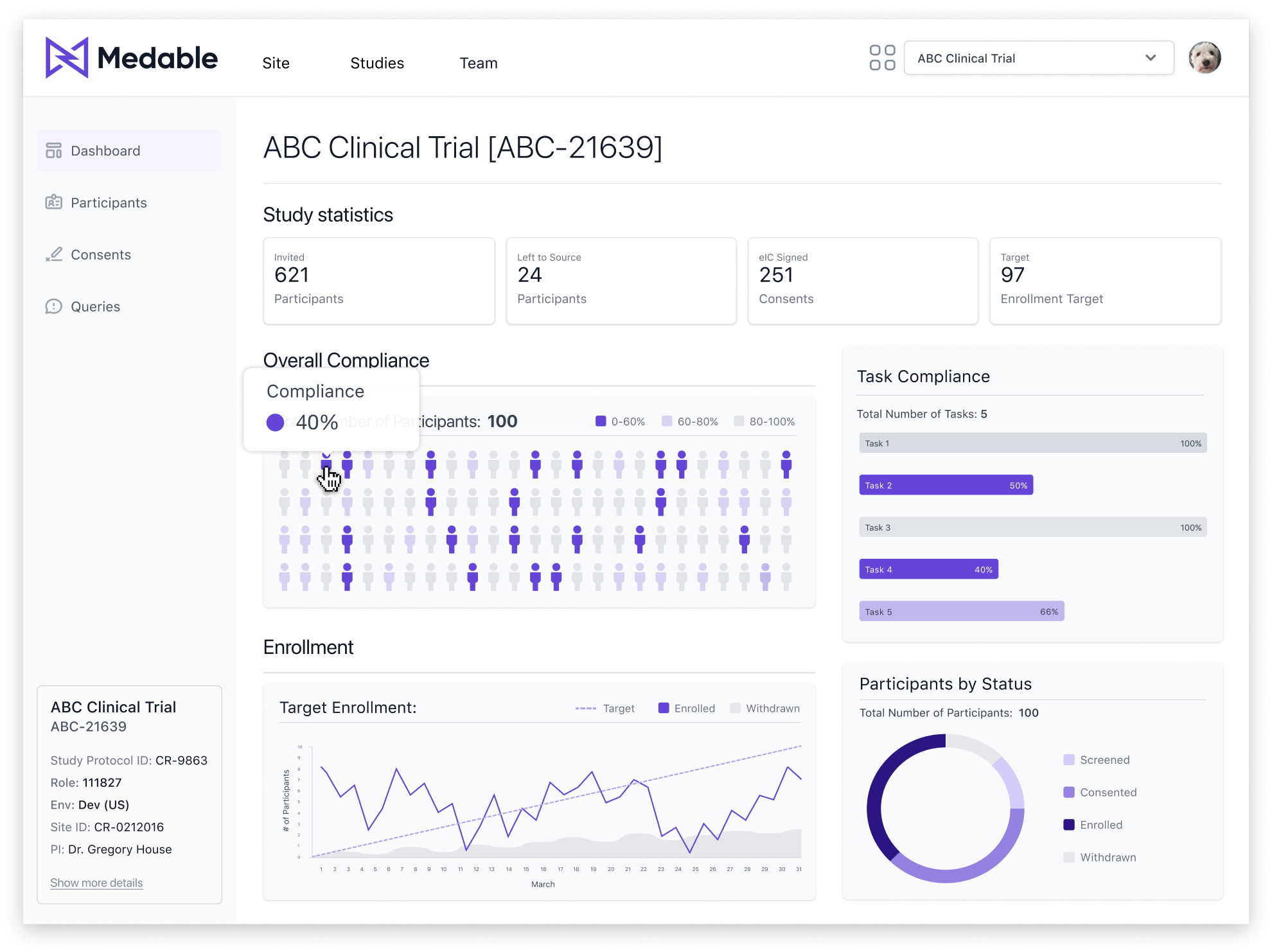
Testing showed users struggled to quickly identify the total count for each compliance variant. Based on these observations, I decided to group variants by similarity and enhance tooltips with additional details to improve usability.
After
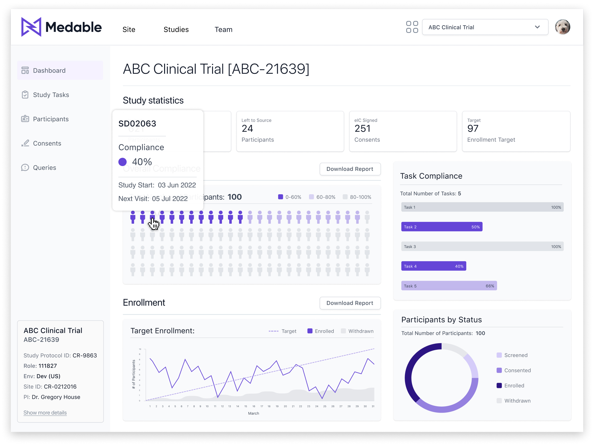
Grouped compliance variants to reduce cognitive load, making data analysis more intuitive and efficient. Also, enhanced tooltips to include study start date, next visit, and Participant ID based on feedback from testing sessions.

Queries reorganization

Queries were reorganized by grouping tables and sections based on status, allowing users to focus on the most relevant ones—specifically, 'Open' queries that require immediate attention.

To improve usability, I implemented an accordion behavior rather than a tab navigation pattern. Through user testing, we discovered that some queries could be repeat issues that had already been resolved. Therefore, presenting all query statuses on a single page made it easier for users to review and cross-reference information, while still allowing quick access to the most critical 'Open' queries.

Before
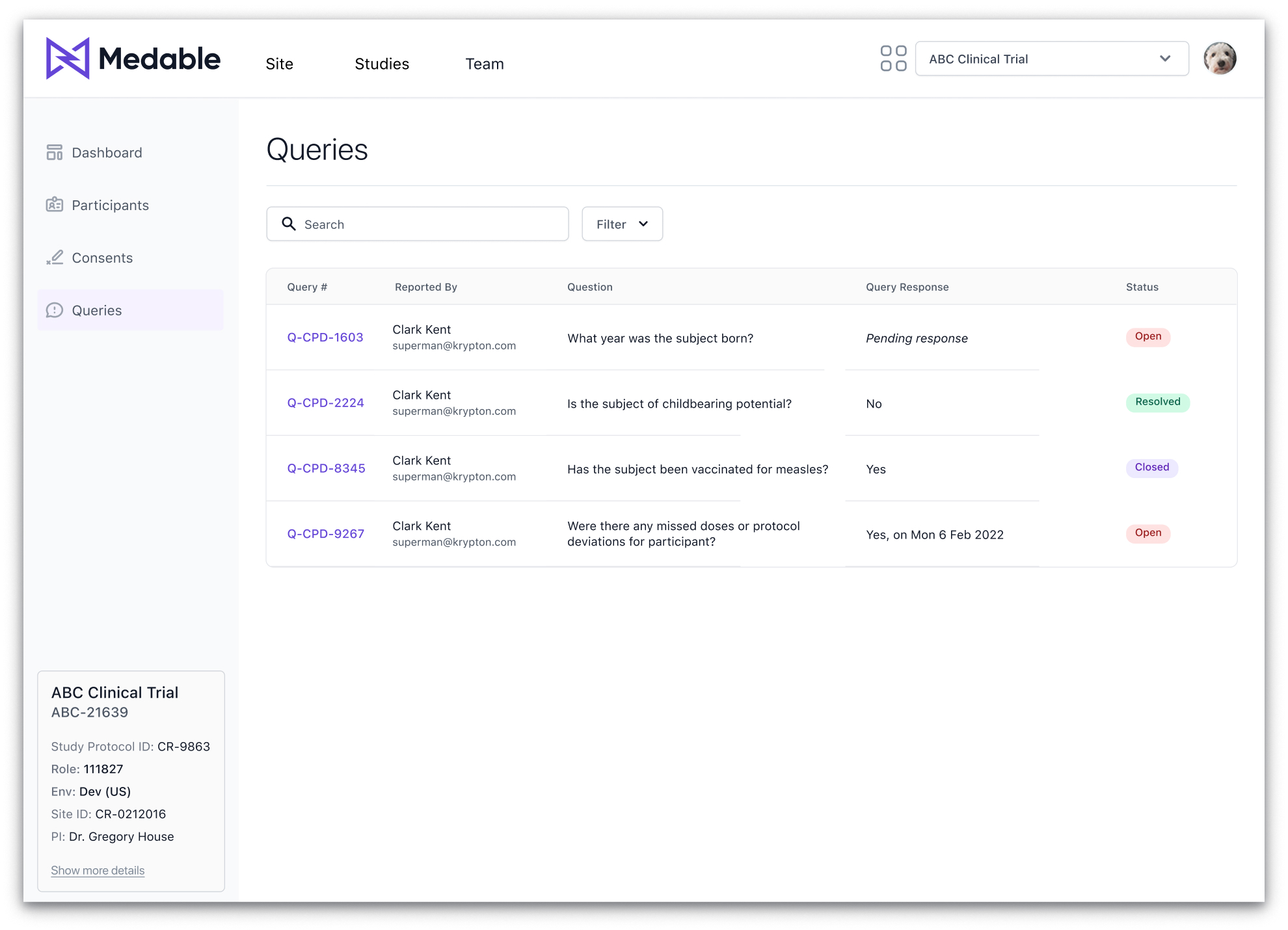
User testing validated the assumption that only open queries required attention, as confirmed through direct feedback.
After
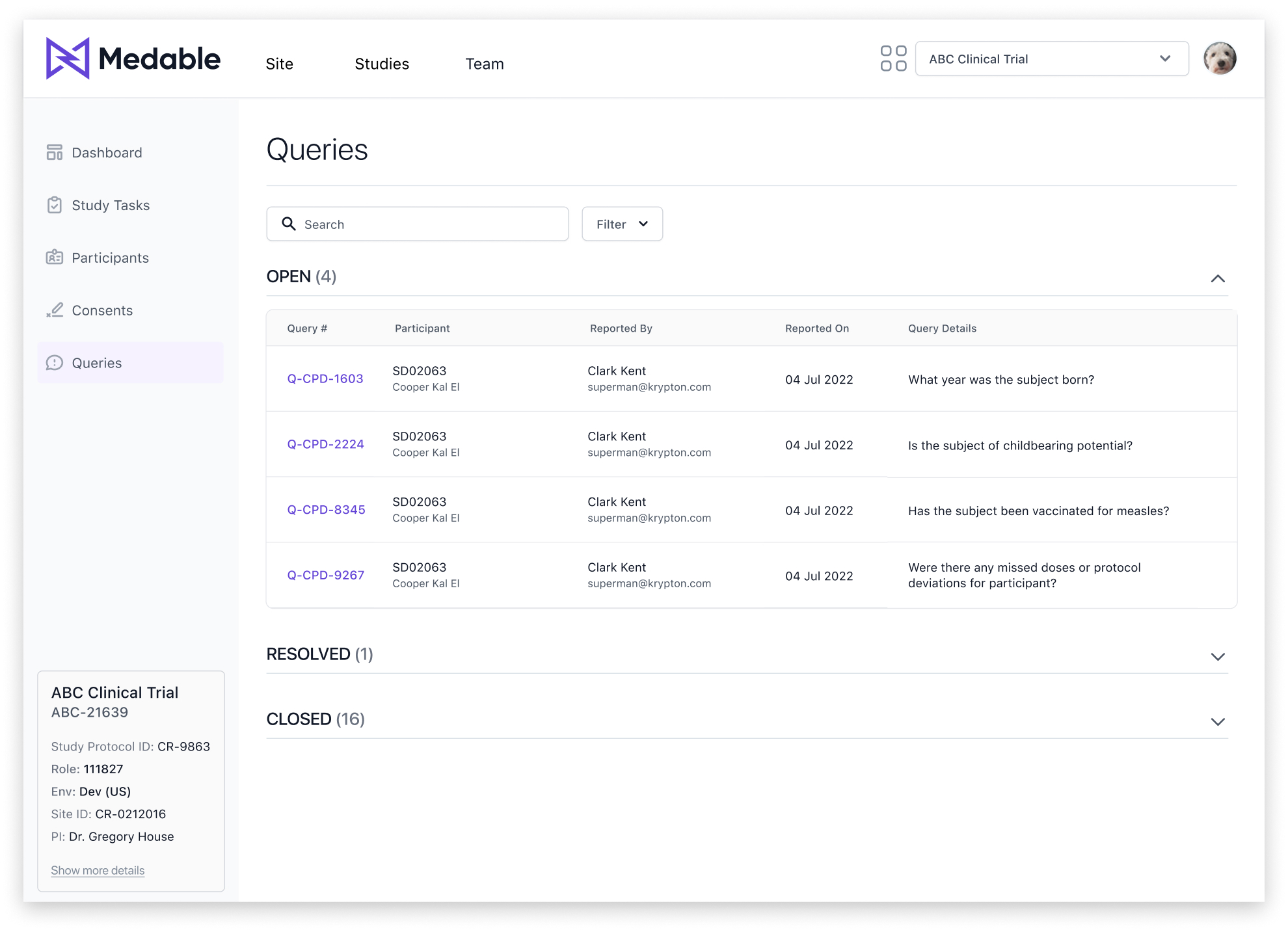
The 'Open' queries section is expanded by default, while 'Resolved' and 'Closed' queries are collapsed, enabling users to navigate and prioritize tasks more efficiently.

New modal pattern

During testing, we identified a usability issue with the existing modal pattern. The Site App required content-heavy modals, resulting in long, cluttered layouts that were difficult for users to interpret.

To address this challenge, I introduced a new modal variant using the "F Pattern" layout principle. This approach aligns with natural eye-scanning patterns, helping users process dense content more efficiently.

Users found the redesigned modal layout significantly easier to read, scan, and navigate. Adding contextual guidance alongside form fields reduced cognitive load and improved task completion rates.

The new pattern incorporates contextual information on the left and input fields on the right, ensuring a clear visual separation and logical flow.

Responsive design

Although responsive design was a lower priority, key screens were optimized for responsiveness, with plans for further development. One major challenge was designing a responsive table pattern that maintained usability, leading to the exploration of card-based layouts as a solution.

Key design decisions included implementing a compact, "skinny" navigation for tablet views to maximize screen space while maintaining usability, as well as developing a responsive table strategy.

I took ownership of introducing a responsive table pattern to the design system. Since the system lacked responsive navigation and table approaches, I developed a strategy that explored using cards for mobile views and collaborated with the design system team to build, review, and approve the new patterns.

Outcome

Conclusion

The redesigned Site App delivered clear wins across usability, efficiency, and satisfaction. User satisfaction rose from 2.9 to 4.6/5, and we achieved a System Usability Score of 93, signaling strong confidence and ease of use. The Net Promoter Score increased to +56, reflecting deeper trust in the platform. Through follow-up interviews, site teams reported saving hours each week on participant management and query resolution. Post-launch, customer satisfaction scores improved for the first time in several quarters—a direct result of workflow improvements and clearer UX.

Tradeoffs

We delayed alignment on the dashboard vision, which led to late-stage rework. Next time, I’d drive earlier stakeholder buy-in around dashboard goals and flexibility to reduce friction and keep momentum high.

Next steps

Post-MVP, the team is expanding Site App capabilities with custom workflows, deeper participant insights, and advanced reporting modules based on additional research findings.