At an early-stage startup, I identified the absence of a cohesive design system, leading to an inconsistent UI and scattered design assets. I initiated a comprehensive audit, established core components in Figma, and introduced structured documentation and governance practices. This approach fostered tighter team cohesion, accelerated design iterations, and enhanced collaboration with engineering, culminating in a scalable design system that improved both speed and quality across the product.
TL;DR
Overview
Recognizing the challenges of a rapidly evolving product with misaligned design and code, I spearheaded the development of a design system to bring clarity and consistency.
I began with a full audit, then introduced lightweight documentation, feedback rituals, and scalable governance. This eliminated inconsistencies, improved handoffs, and increased team confidence.
Designers gained greater visibility, while engineers benefited from clearer implementation paths. What started as a fragile foundation evolved into a scalable system—bridging design and engineering through a shared language and consistent practices.
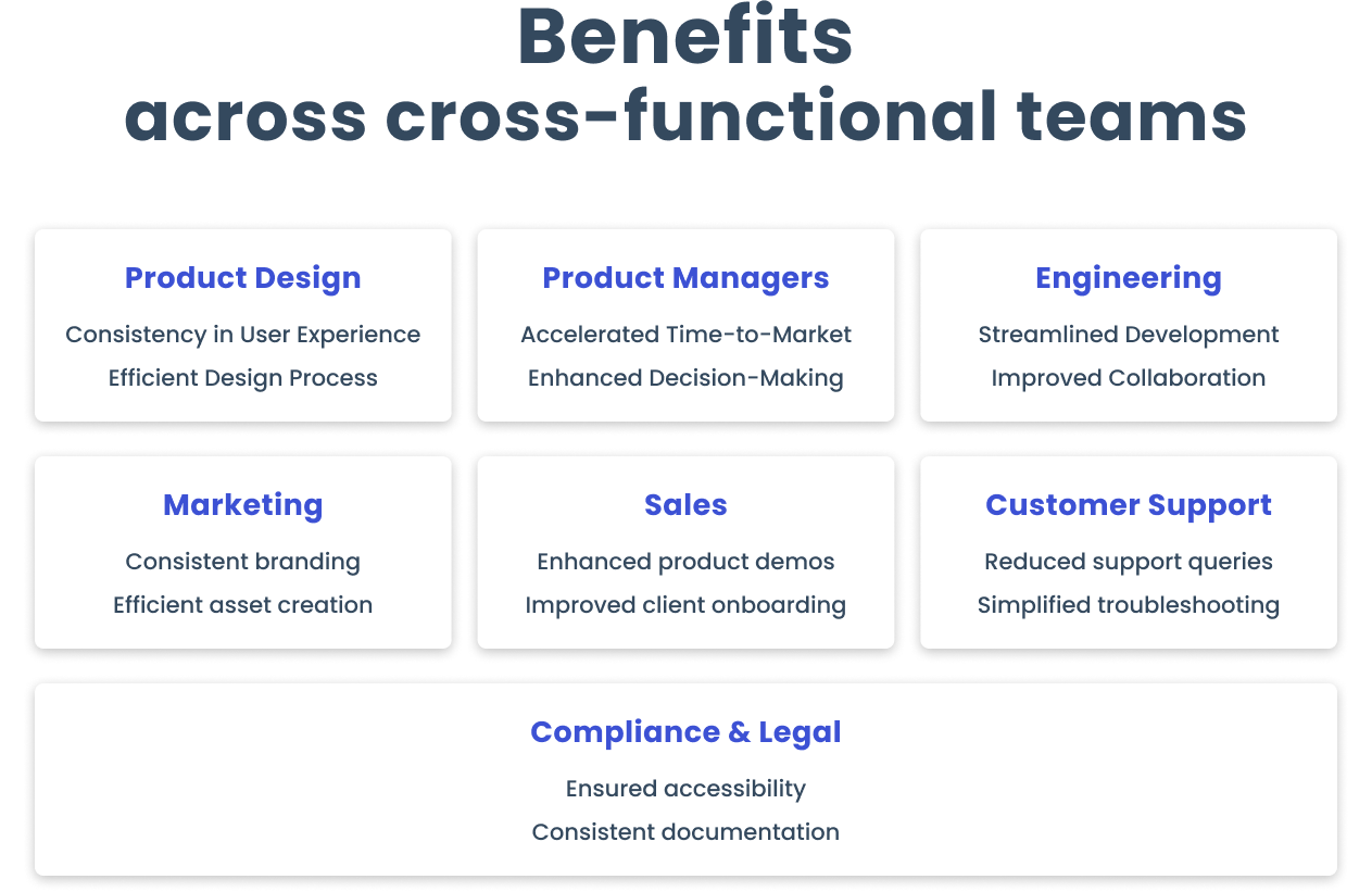
Cross-functional impact of a design system — streamlining collaboration and driving consistency across design, product, engineering, and go-to-market teams.
Overview
Recognizing the challenges of a rapidly evolving product with misaligned design and code, I spearheaded the development of a design system to bring clarity and consistency.
I began with a full audit, then introduced lightweight documentation, feedback rituals, and scalable governance. This eliminated inconsistencies, improved handoffs, and increased team confidence.
Designers gained greater visibility, while engineers benefited from clearer implementation paths. What started as a fragile foundation evolved into a scalable system—bridging design and engineering through a shared language and consistent practices.
Cross-functional impact of a design system — streamlining collaboration and driving consistency across design, product, engineering, and go-to-market teams.
Discovery & Planning
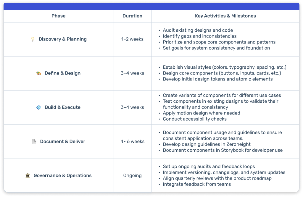
A proposed roadmap outlining each phase of a design system buildout — from initial planning to long-term governance. While it captures intended timelines and core activities, it's designed to evolve alongside team needs and priorities.
Strategy
Our strategy began with discovery and planning, auditing existing work to identify gaps and prioritize key components. This informed my approach to defining and designing foundational elements, leading to the building, integration, and validation of components to ensure consistency and usability.
I then documented and delivered the system, consolidating assets in Figma while expanding documentation in Zeroheight and aligning it with Storybook. To ensure long-term relevance, we established governance practices with clear roles, collaboration, and regular audits.
A proposed roadmap outlining each phase of a design system buildout — from initial planning to long-term governance. While it captures intended timelines and core activities, it's designed to evolve alongside team needs and priorities.
Stakeholder buy-in
To actualize the strategy, I engaged stakeholders across Product, Design, and Engineering, emphasizing the benefits of a unified system. Through personalized discussions, collaborative workshops, and a comprehensive internal memo detailing our vision, we achieved alignment and established a clear roadmap for execution.
This commitment to securing buy-in not only helped communicate the benefits of a design system but also mapped out a clear roadmap for exploration, execution, and delivery. By aligning closely with engineering, we ensured the necessary resources and support were in place, setting the stage for a smooth rollout.
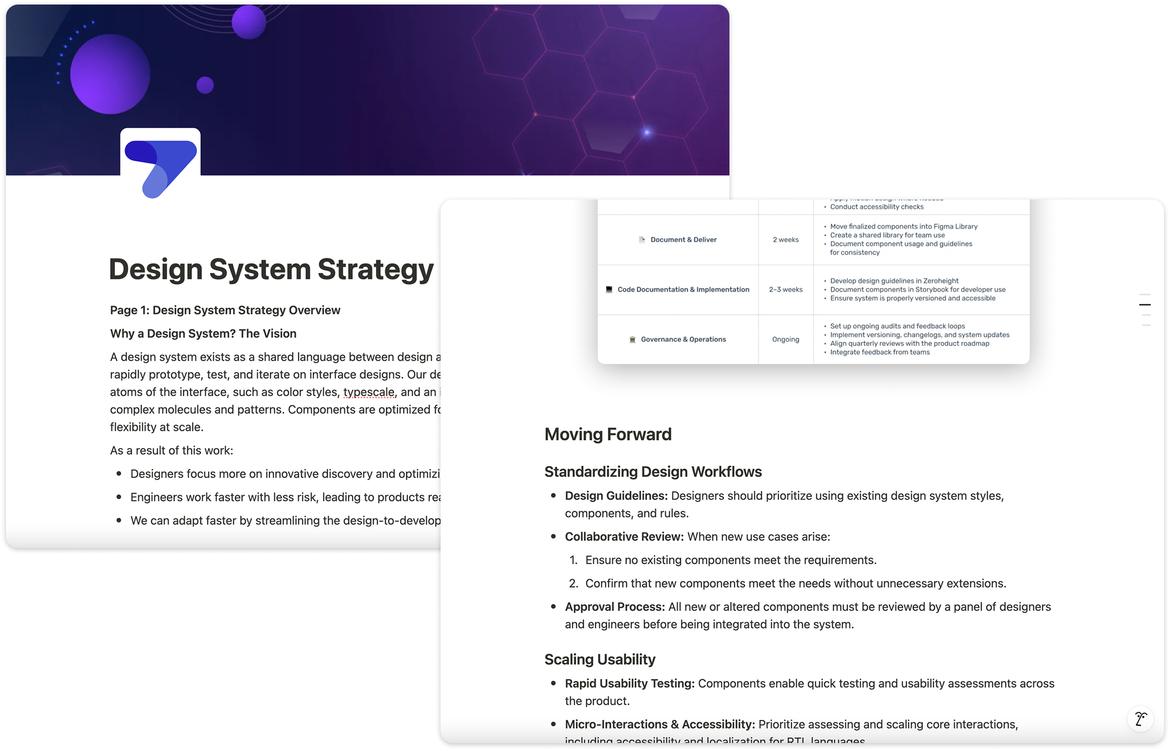
My internal memo on the value of design systems helped make the case for headcount and roadmap space, outlining a strategic overview and actionable steps for building a cohesive, scalable system that enhances collaboration between design and engineering teams.
Stakeholder buy-in
To actualize the strategy, I engaged stakeholders across Product, Design, and Engineering, emphasizing the benefits of a unified system. Through personalized discussions, collaborative workshops, and a comprehensive internal memo detailing our vision, we achieved alignment and established a clear roadmap for execution.
This commitment to securing buy-in not only helped communicate the benefits of a design system but also mapped out a clear roadmap for exploration, execution, and delivery. By aligning closely with engineering, we ensured the necessary resources and support were in place, setting the stage for a smooth rollout.
My internal memo on the value of design systems helped make the case for headcount and roadmap space, outlining a strategic overview and actionable steps for building a cohesive, scalable system that enhances collaboration between design and engineering teams.
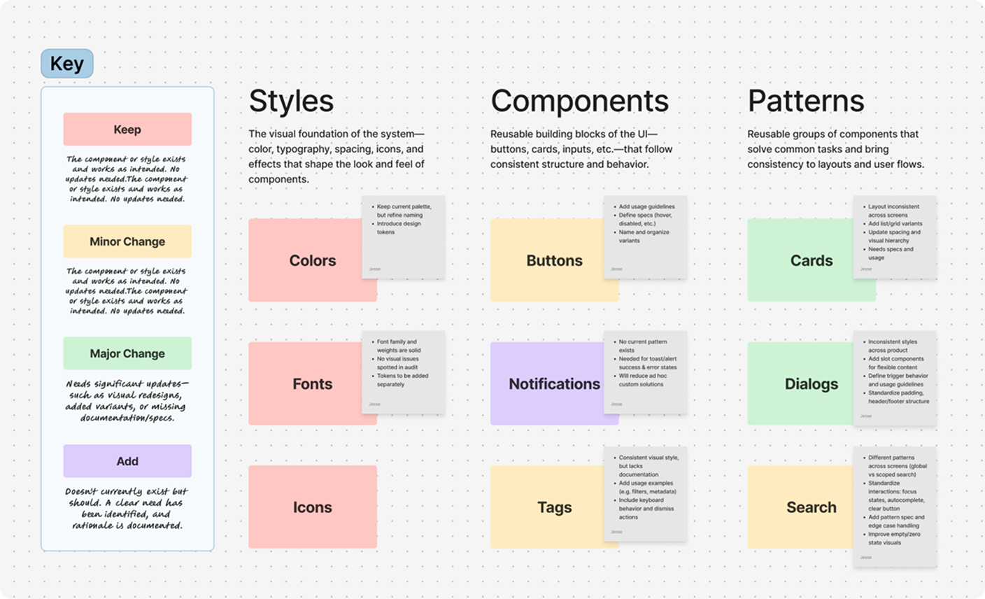
A snapshot from our UI audit—a visual breakdown of what to keep (red), refine (yellow/green), or add (purple). This excerpt focuses on key styles and components that shaped the foundation of the system.
UI audit
With the strategy and stakeholder support in place, we moved on to a comprehensive UI audit.
Collaborating with a visual designer and lead engineer, I conducted a comprehensive UI audit to align the team and establish priorities. We systematically cataloged styles, components, and patterns, categorizing each based on its current state to inform our design system roadmap.
This structured audit not only gave us visibility into the current state but also helped us systematically scope and phase the system rollout, making the transition more manageable and transparent.
A snapshot from our UI audit—a visual breakdown of what to keep (red), refine (yellow/green), or add (purple). This excerpt focuses on key styles and components that shaped the foundation of the system.
Define & Design
Styles
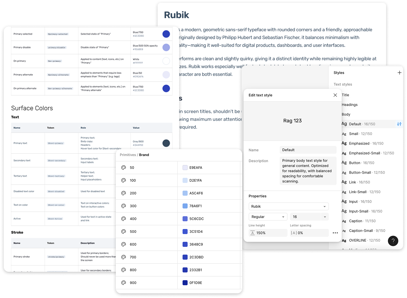
I began by focusing on the foundational elements (atoms) of our design system—colors, fonts, grid, shadows, and spacing.
Since the fonts and color palettes were already selected according to brand guidelines and intended for accessible use, there was no need for further exploration. Instead, I focused on defining usage guidelines for each and creating design tokens to ensure consistency between design and engineering.
However, icons were inconsistent across the Figma file. After discussing with the lead engineer, I opted to use Radix Icons for iconography. This choice offered a clean, minimal icon set with React-friendly integration, making implementation more streamlined and consistency easier to maintain across the system.
Styles
I began by focusing on the foundational elements (atoms) of our design system—colors, fonts, grid, shadows, and spacing.
Since the fonts and color palettes were already selected according to brand guidelines and intended for accessible use, there was no need for further exploration. Instead, I focused on defining usage guidelines for each and creating design tokens to ensure consistency between design and engineering.
However, icons were inconsistent across the Figma file. After discussing with the lead engineer, I opted to use Radix Icons for iconography. This choice offered a clean, minimal icon set with React-friendly integration, making implementation more streamlined and consistency easier to maintain across the system.
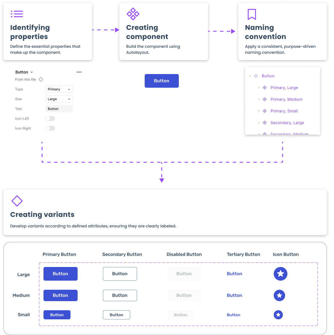
Components
With our visual foundations in place, we began building out the system’s core components—practical UI elements that combine styles, behavior, and interaction patterns. These components serve as the backbone of the interface, built for reusability, accessibility, and smooth handoff between design and engineering.
Rather than building an exhaustive library upfront, I focused on the components essential to the MVP, along with those we anticipated needing as the product scaled. This lean, needs-based approach ensured we delivered immediate value without overengineering. Knowing the system would evolve over time, we treated it as a living product—prioritizing flexibility and iteration over volume.
Patterns
Once a solid component library was in place, the next step was creating patterns or organisms—more complex, reusable structures that combine multiple components into cohesive UI sections.
Patterns represent the synthesis of foundational elements—atoms, molecules, and layout structures—into cohesive, reusable UI sections. In the navigation example, styles (atoms) and components (molecules) come together, forming the skeleton and ultimately shaping patterns (organisms) within light and dark themes.
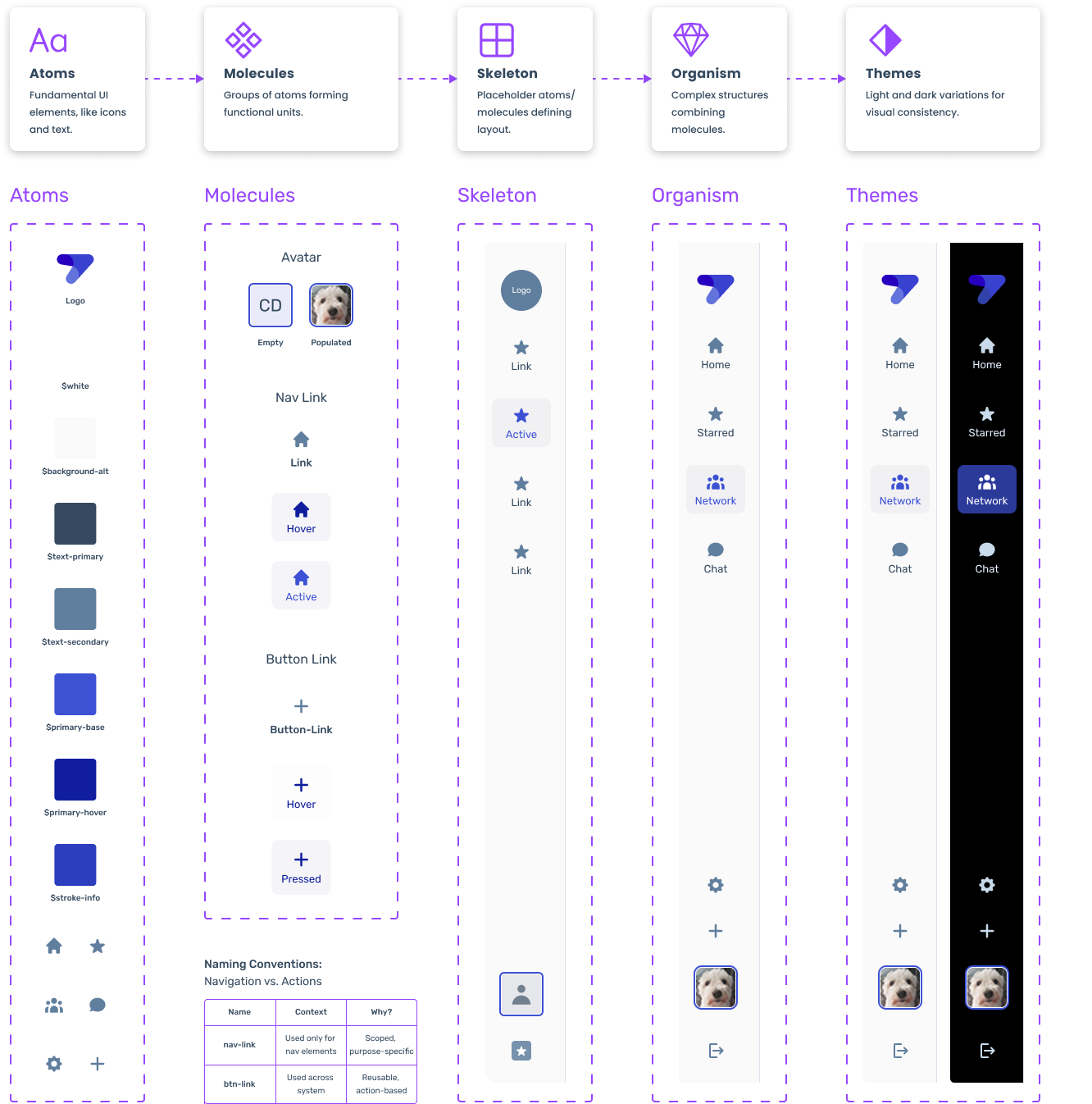
The evolution of navigation: from foundational styles (atoms) to components (molecules), skeleton structure, patterns (organism), and theme variations (light & dark).
Patterns
Once a solid component library was in place, the next step was creating patterns or organisms—more complex, reusable structures that combine multiple components into cohesive UI sections.
Patterns represent the synthesis of foundational elements—atoms, molecules, and layout structures—into cohesive, reusable UI sections. In the navigation example, styles (atoms) and components (molecules) come together, forming the skeleton and ultimately shaping patterns (organisms) within light and dark themes.
The evolution of navigation: from foundational styles (atoms) to components (molecules), skeleton structure, patterns (organism), and theme variations (light & dark).
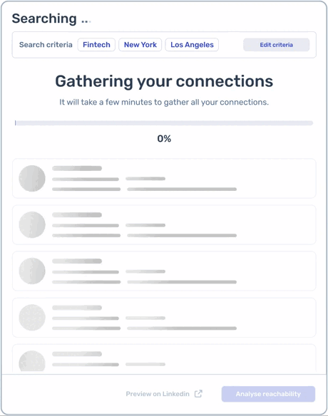
To improve user experience during lengthy search times (2-3 minutes), I introduced motion patterns, including a progress bar and a subtle gloss effect on empty cards, providing visual feedback and maintaining user engagement.
Motion
Included motion design in our system to help maintain a cohesive visual language and support accessibility by defining timing and easing that accommodated users with motion sensitivities.
Documented motion directly in Figma, allowing designers and developers to visualize animations, understand their purpose, and access implementation details—reducing inconsistencies and improving handoffs.
To improve user experience during lengthy search times (2-3 minutes), I introduced motion patterns, including a progress bar and a subtle gloss effect on empty cards, providing visual feedback and maintaining user engagement.
Accessibility
Accessibility was a key focus when designing the component library. I ensured that all elements met WCAG AA standards, including thorough contrast checks, to guarantee usability for diverse audiences.
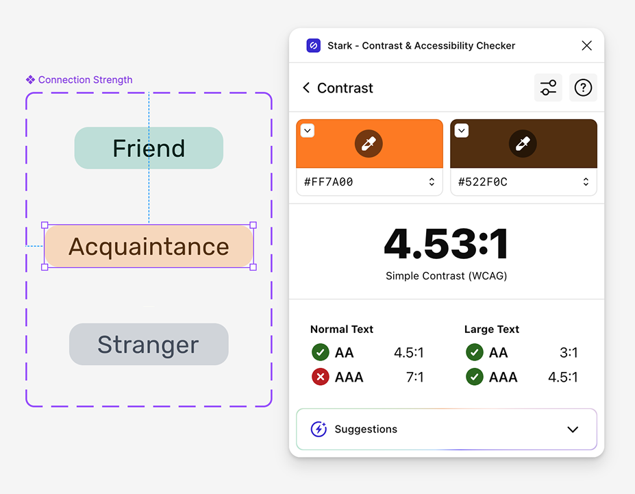
Ensuring accessibility with Stark—contrast checks for connection strength badges to meet WCAG AA standards.
Accessibility
Accessibility was a key focus when designing the component library. I ensured that all elements met WCAG AA standards, including thorough contrast checks, to guarantee usability for diverse audiences.
Ensuring accessibility with Stark—contrast checks for connection strength badges to meet WCAG AA standards.
Document & Deliver
Figma library
I began by documenting each component and pattern within the Figma Design System file, ensuring clarity and consistency for both designers and developers. This comprehensive documentation served as the foundation for further detailing in Zeroheight and for building Storybook components, enabling broader accessibility and seamless implementation.
Documentation Elements:
- Usage: Provides guidance on when and how to use the component or pattern. This section outlines best practices and common scenarios to ensure consistent implementation across the product.
- Variants: Lists the different versions or states of a component (e.g., button sizes, alert types). Including variants helps teams understand the flexibility and adaptability of a component for different contexts.
- Anatomy: Breaks down the structural components that make up the element (e.g., label, icon, border). This visual breakdown helps designers and developers understand how the component is constructed.
- Specifications: Covers technical details such as spacing, padding, typography, and color usage. These precise specs ensure that the visual and functional aspects are implemented as intended.
- Behavior: Describes how the component interacts or responds to user input (e.g., hover states, transitions, or error handling). Including behavioral documentation helps maintain consistency and accessibility.
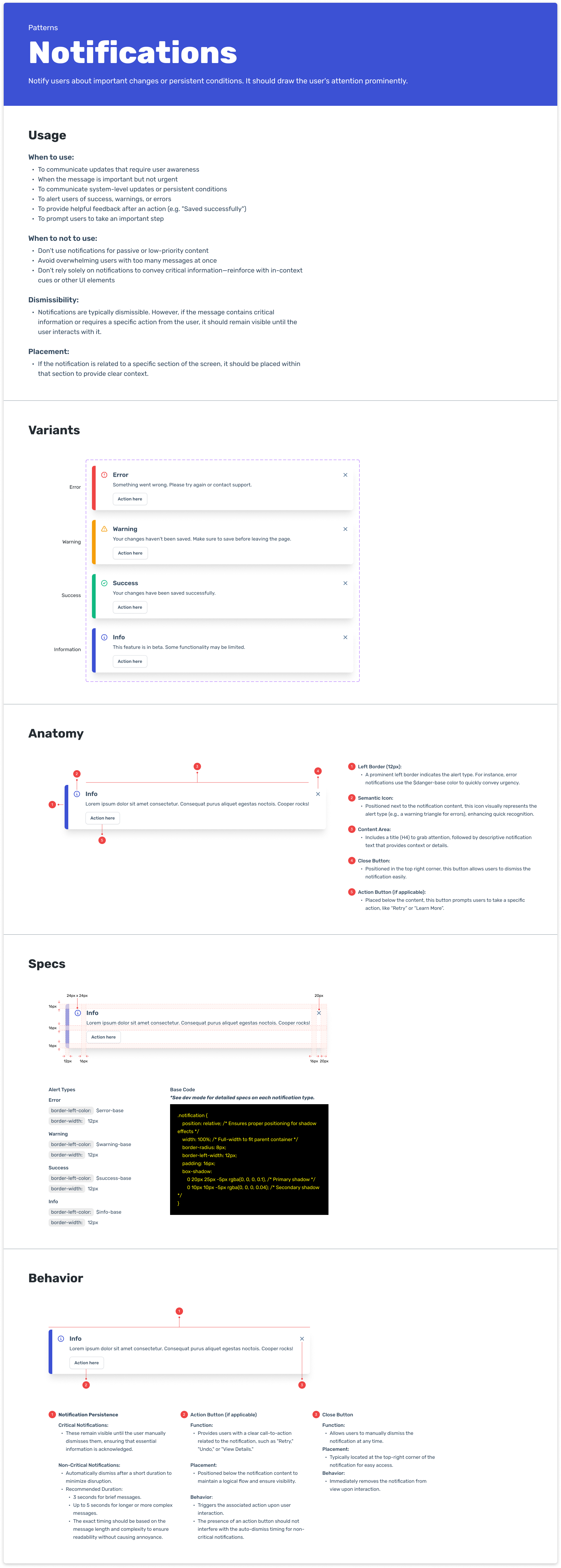
Zeroheight
After finalizing the Figma components and patterns, I extended the documentation from the Figma library to Zeroheight—a centralized hub where the design system’s guidelines are accessible to the team.
By hosting the design system in Zeroheight, we ensure that guidelines, usage instructions, and technical specifications are easily accessible by anyone, regularly updated, and consistently referenced.
This structured approach fosters alignment between teams and reduces ambiguity during implementation.
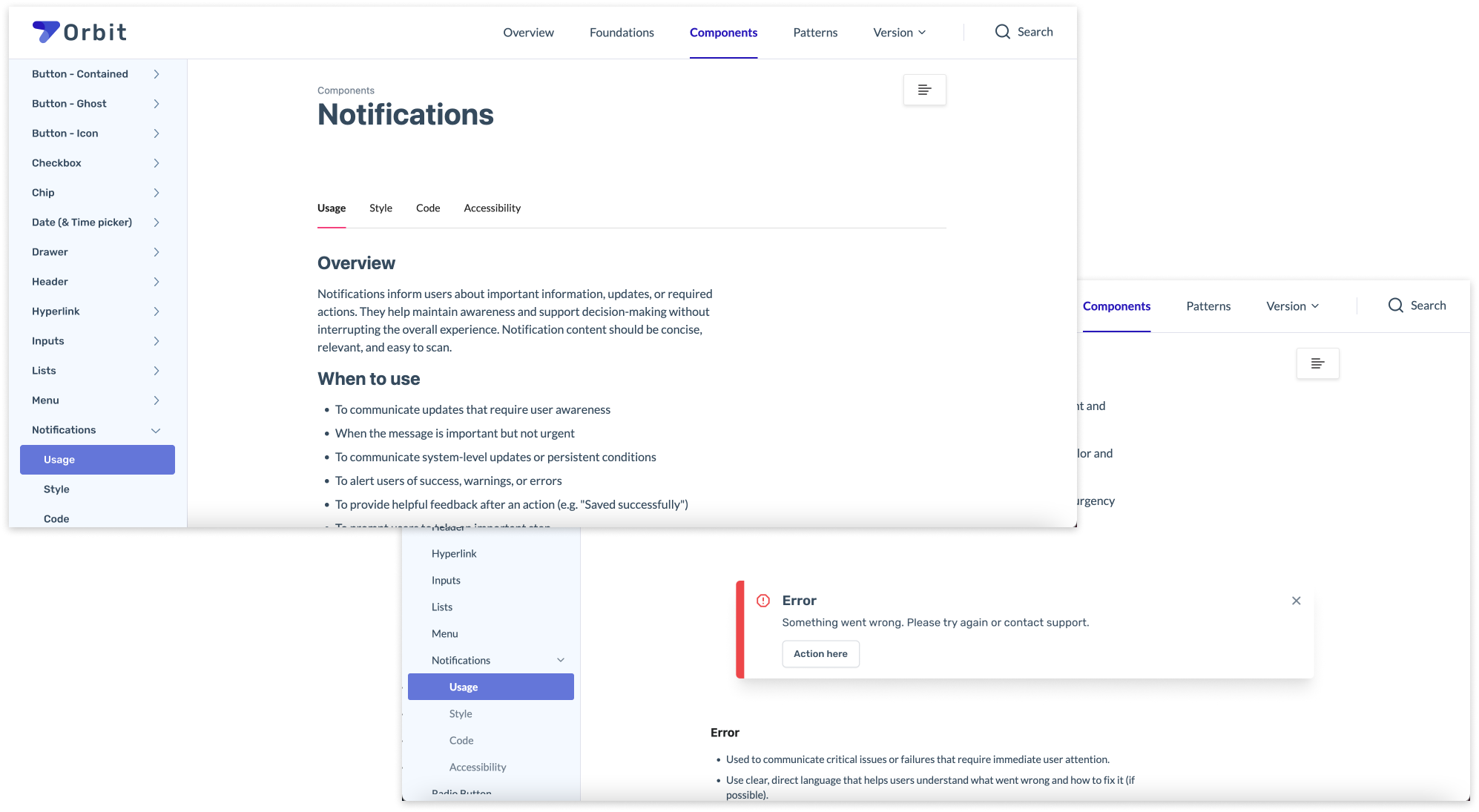
Clear documentation in Zeroheight ensures that anyone can understand the usage and implementation of error notifications, promoting consistency across the team.
Zeroheight
After finalizing the Figma components and patterns, I extended the documentation from the Figma library to Zeroheight—a centralized hub where the design system’s guidelines are accessible to the team.
By hosting the design system in Zeroheight, we ensure that guidelines, usage instructions, and technical specifications are easily accessible by anyone, regularly updated, and consistently referenced.
This structured approach fosters alignment between teams and reduces ambiguity during implementation.
Clear documentation in Zeroheight ensures that anyone can understand the usage and implementation of error notifications, promoting consistency across the team.
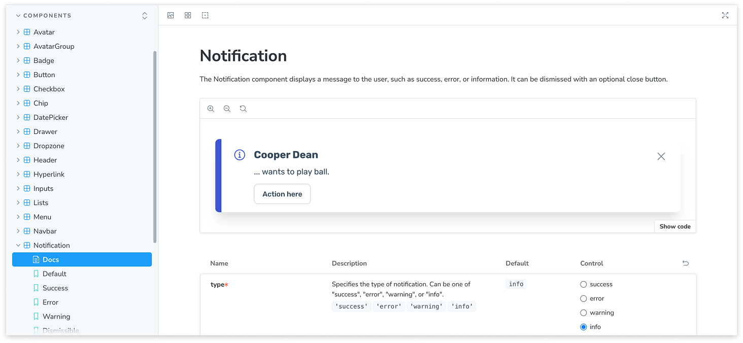
To accelerate implementation, I took the initiative to code some of the components directly in Storybook. This hands-on approach helped speed up the integration process and maintain consistency across the design system.
Storybook
To modernize our design system, we rebuilt the repository from scratch using Storybook—a powerful tool that allows us to create an interactive library for components in isolation.
Storybook supports all popular frontend frameworks, making it ideal for our diverse codebase. It also enables the documentation of use cases as stories, simplifying the process of finding, sharing, and reusing components.
Additionally, Storybook integrates seamlessly with Zeroheight, similar to Figma, to ensure that design and development documentation stays synchronized and consistent
To accelerate implementation, I took the initiative to code some of the components directly in Storybook. This hands-on approach helped speed up the integration process and maintain consistency across the design system.
Governance & Operations
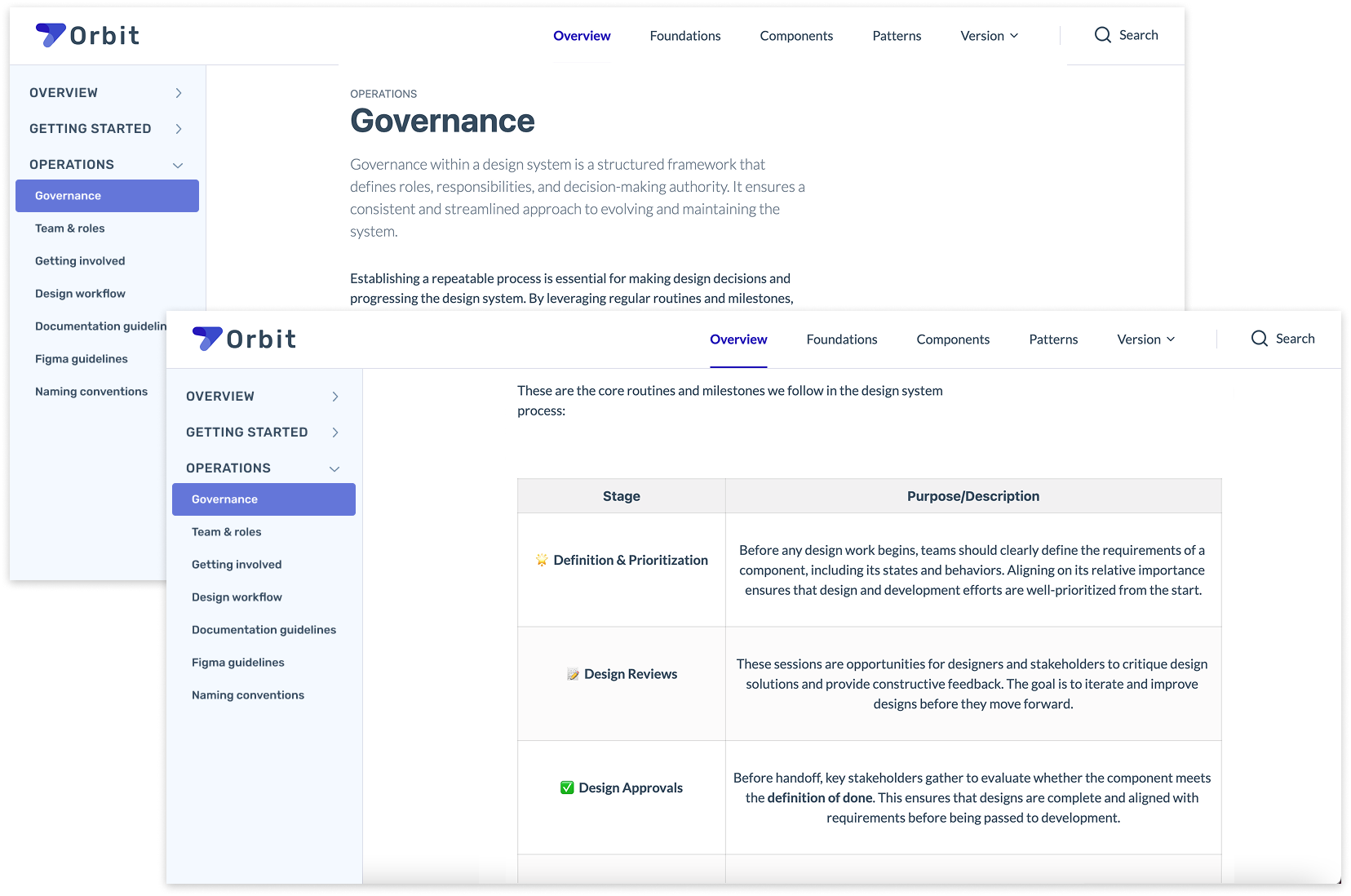
Overview of our governance structure and core routines, including definition, prioritization, design reviews, approvals, engineering handoffs, design and engineering QA, and implementation.
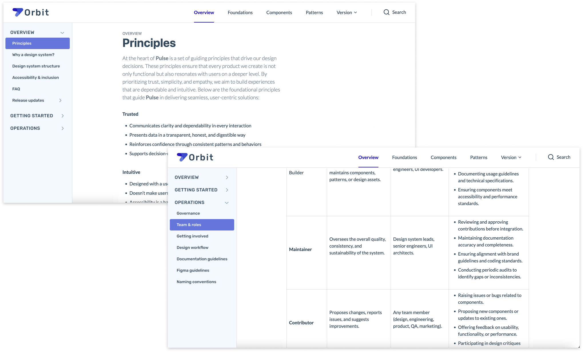
Team & processes
After stabilizing the design system components and documentation, I focused on creating governance practices that would ensure the system’s growth and sustainability.
This involved defining clear roles—such as Builder, Maintainer, Contributor, and User—to clarify ownership, contribution, and maintenance. Individuals could hold multiple roles depending on their involvement and expertise.
Additionally, I established well-defined processes for making updates and improvements, which helped the entire team understand how to contribute and evolve the system efficiently.
Overview of our governance structure and core routines, including definition, prioritization, design reviews, approvals, engineering handoffs, design and engineering QA, and implementation.
Collaboration & contribution
I established a structured critique process where component or pattern updates would be presented during design critiques. This approach gave our other designer and engineers early visibility, allowing them to provide valuable feedback and reduce the risk of scope creep. By fostering early collaboration, I encouraged more intentional and thoughtful decision-making.
To streamline contributions, I utilized Figma’s branching capabilities, allowing our other designer to work independently while maintaining a clear review process before merging changes into the system. This balanced creative freedom with quality control, helping us evolve the system efficiently.
I also made the contribution process transparent and accessible by documenting it in Zeroheight. This ensured that anyone could participate—whether by sharing ideas, proposing new components, or collaborating on improvements—fostering a culture of collective ownership and continuous development.
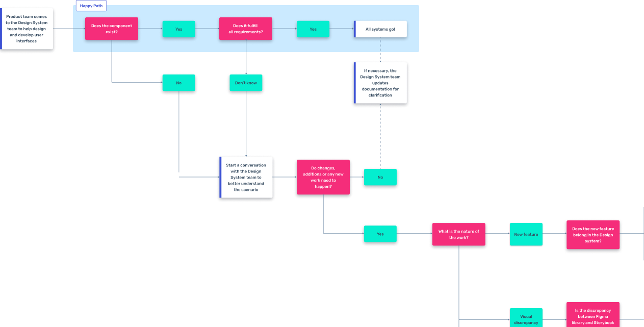
Snapshot of our governance process flow.
Collaboration & contribution
I established a structured critique process where component or pattern updates would be presented during design critiques. This approach gave our other designer and engineers early visibility, allowing them to provide valuable feedback and reduce the risk of scope creep. By fostering early collaboration, I encouraged more intentional and thoughtful decision-making.
To streamline contributions, I utilized Figma’s branching capabilities, allowing our other designer to work independently while maintaining a clear review process before merging changes into the system. This balanced creative freedom with quality control, helping us evolve the system efficiently.
I also made the contribution process transparent and accessible by documenting it in Zeroheight. This ensured that anyone could participate—whether by sharing ideas, proposing new components, or collaborating on improvements—fostering a culture of collective ownership and continuous development.
Snapshot of our governance process flow.
Clear documentation in Zeroheight outlines our design principles and roles within the system, promoting shared ownership and consistent implementation across the team.
Documentation & tracking progress
Ensuring consistency and facilitating adoption, we meticulously documented components in Storybook and Zeroheight. Zeroheight functioned as the central repository for guidelines, usage instructions, and technical specifications, complemented by Figma's detailed documentation on component usage and behavior.
This dual documentation strategy made it easy for designers and engineers to find the information they needed, fostering alignment and reducing ambiguity.
We tracked progress systematically using JIRA, keeping design and development efforts aligned in one place. This approach enabled continuous improvement, streamlined collaboration, and maintained transparency throughout the design system's lifecycle.
Clear documentation in Zeroheight outlines our design principles and roles within the system, promoting shared ownership and consistent implementation across the team.
Conclusion
When I joined, I identified the lack of a cohesive design system, resulting in an inconsistent UI and fragmented design assets that didn’t align with the front-end system. During my time there, I initiated a comprehensive audit, established core components in Figma, and introduced structured documentation and governance practices on the design side. I also worked closely with engineering to make the design system a shared priority.
As a result, the team began to see improvements in quality, alignment, efficiency, and stakeholder buy-in. After I left, I learned that the team continued to follow the processes I had established, demonstrating lasting adoption and commitment to the design system’s success.
Reflecting on the process, an anti-pattern I've observed teams falling into when building design systems is focusing too much on the visible parts—like components, libraries, and styles—while overlooking the invisible elements that truly make them successful: how to use them, when to evolve them, and why they matter for the team’s overall success.
© 2026 Jesse Dean