TL;DR

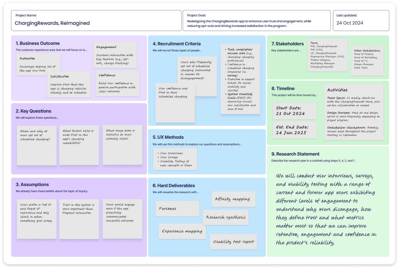
At EnergyHub, I led the end-to-end redesign of the ChargingRewards app to reduce opt-outs and rebuild user trust. EV drivers were confused by the app’s logic, lacked visibility into rewards, and didn’t feel in control—resulting in churn that threatened both product ROI and grid stability. Working with a lean cross-functional team, I drove UX research, strategy, design, and testing. Our solution focused on transparency, motivation, and behavioral confidence—ultimately reducing opt-outs by 46% and earning a 4.7/5 trust rating at beta.

Introduction

EVs are reshaping the grid—but when everyone plugs in after work, utilities face dangerous demand spikes. ChargingRewards was designed to fix this by incentivizing smart, delayed charging. But users didn’t understand it, didn’t trust it, and were opting out in high numbers.

I led the end-to-end redesign as the sole designer on a lean team. I owned research, UX, strategy, and delivery, rebuilding trust and reducing opt-outs under tight constraints.

This wasn’t just a UX issue—it was a behavioral confidence problem with real impact. Every opt-out strained grid reliability. Our goal: rebuild trust fast, with limited resources and high stakes.

Discovery & Research

To kick off discovery, I facilitated a collaborative Lean UX Canvas session with PM, marketing, support, and data teams. This helped us surface key assumptions, define hypotheses, and align on user needs and business goals—giving the team a shared foundation and focusing our research efforts around the highest-risk unknowns.

Kicking off with alignment

With no dedicated researcher on the team, I owned the full discovery process end to end. I kicked things off with a cross-functional discovery sprint—pulling in PM, marketing, support, and the data team—to surface blind spots early and align on core assumptions.

We used a Lean UX Canvas to collaboratively frame the problem space, define hypotheses, identify key user segments, and align on desired outcomes. This gave the team a shared language and helped prioritize our research and design efforts around real user needs and business goals.

To kick off discovery, I facilitated a collaborative Lean UX Canvas session with PM, marketing, support, and data teams. This helped us surface key assumptions, define hypotheses, and align on user needs and business goals—giving the team a shared foundation and focusing our research efforts around the highest-risk unknowns.

Conducting research

From there, I led mixed-methods research.

  • Performed a heuristic evaluation of the current app that revealed major UX gaps around feedback, clarity, and hierarchy.
  • Conducted interviews with current and churned users to understand how they think about and interact with the app.
  • Distributed targeted surveys in collaboration with our marketing lead to validate hypotheses at scale.
  • Mined support tickets and used GPT to cluster recurring pain points—turning qualitative noise into structured insights fast.
To validate early hypotheses, I led a mix of qualitative interviews and quantitative surveys. This image highlights recurring themes from user responses—around trust, rewards clarity, and environmental impact. These insights helped shape our problem framing and guided design decisions toward transparency, actionability, and behavioral confidence.
Visualized the current end-to-end experience to identify where trust broke down and friction emerged. This journey map aligned cross-functional teams around key pain points and opportunities, grounding strategy in real user behavior.

Synthesizing findings

To turn research into action, I synthesized user quotes, behavior signals, and survey data into a FigJam board, then led a workshop with the team to surface core needs.

Three key themes emerged: reassurance (“Will my car be ready?”), transparency (“Why is it not charging now?”), and rewards visibility (“What am I earning?”). These reframed the problem—from usability to a trust and behavioral confidence gap.

To anchor strategy in real behavior, I mapped the customer journey end-to-end, identifying where friction emerged and trust broke down. This artifact became a shared tool across teams to align on pain points, opportunities, and success metrics.

Visualized the current end-to-end experience to identify where trust broke down and friction emerged. This journey map aligned cross-functional teams around key pain points and opportunities, grounding strategy in real user behavior.

Strategy & Ideation

Execution

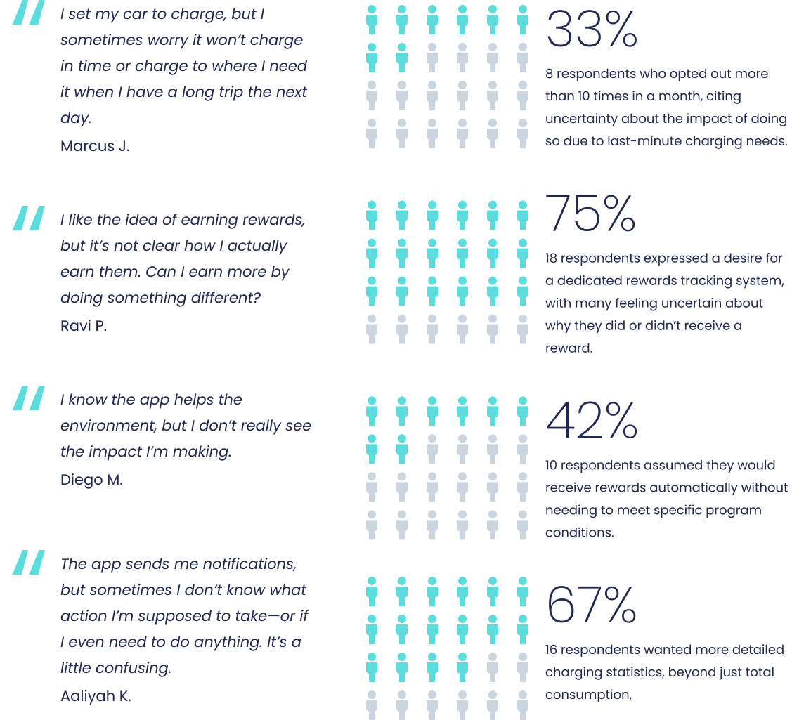
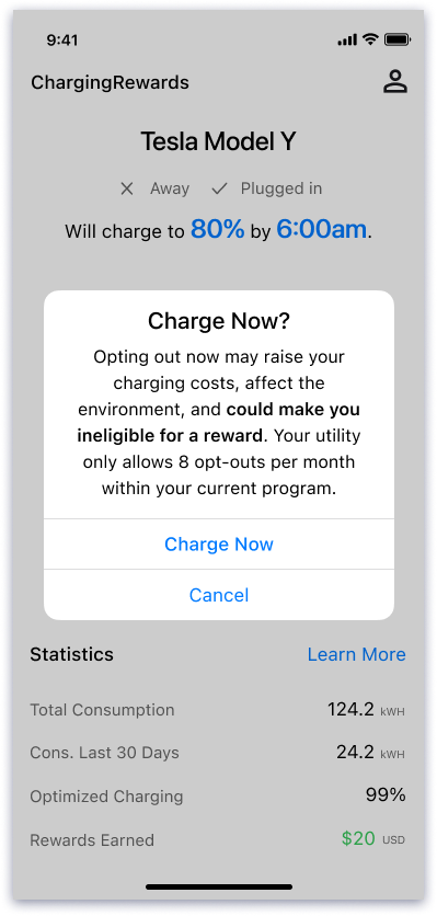
What seemed like a usability issue was actually a trust problem.

Users weren’t just confused by the interface—they didn’t fully understand how managed charging worked, and they didn’t trust a system making decisions behind the scenes. This lack of confidence led many to opt out, threatening both the user experience and the program’s ROI.

So I reframed the challenge:

  • How might we build trust and make the invisible benefits of managed charging feel real and worth staying opted in for?

This shift—from usability to behavioral design—became the foundation for every decision moving forward.

We began with broad ideation, then I partnered with our PM to define feature scope and value. In a cross-functional workshop, we prioritized by impact vs. effort. I documented everything in FigJam, linking features to JIRA tickets for clarity and traceability.

Defining features

From there, I co-led a feature ideation and prioritization session, mapping opportunities by user value versus effort.

I advocated for early wins that would immediately reduce opt-outs—like alerting users about the risk of missing a reward when opting out, and providing charging controls that felt empowering rather than risky. Heavier features, such as flexible time windows and usage history, were scoped for future releases. The result was a scrappy, retention-focused roadmap grounded in user trust—not feature volume.

We began with broad ideation, then I partnered with our PM to define feature scope and value. In a cross-functional workshop, we prioritized by impact vs. effort. I documented everything in FigJam, linking features to JIRA tickets for clarity and traceability.

Information architecture

Before diving into design, I zoomed out to rethink the app’s information architecture and interaction model. I mapped how users move through the experience—what they need to do, when, and why—to anticipate friction points and align workflows with real user intent.

In parallel, I mapped system behavior behind the scenes, ensuring backend logic could scale with future features like personalized incentives and smarter automation.

This early structure work brought clarity to the product vision, streamlined downstream design, and helped us proactively address edge cases before they became blockers.

Mapped user workflows and system behavior in parallel to uncover friction early, align expectations, and ensure the experience could scale with future features.
User flow illustrating state transitions and interactions during charging. This diagram maps how the dashboard evolves in response to charge events—helping engineering reason through logic, de-risk complex flows, and support implementation planning.

User flows

I mapped both user flows (e.g., onboarding, opt-out, rewards check-in) and state flows (e.g., reward triggers, charge events) to help engineering reason through logic and edge cases. These diagrams became crucial communication tools that drove alignment and accelerated velocity.

User flows

I mapped both user flows (e.g., onboarding, opt-out, rewards check-in) and state flows (e.g., reward triggers, charge events) to help engineering reason through logic and edge cases. These diagrams became crucial communication tools that drove alignment and accelerated velocity.

User flow illustrating state transitions and interactions during charging. This diagram maps how the dashboard evolves in response to charge events—helping engineering reason through logic, de-risk complex flows, and support implementation planning.

Designing for Trust: From Quick Wins to Foundational Redesign

Trust by design

With a clear strategy, I led an iterative, impact-driven design process focused on four behavioral pillars: reassurance, transparency, control, and motivation. These directly addressed user trust gaps uncovered in research.

I started with fast, high-impact fixes to reduce churn: rewriting onboarding content and redesigning the opt-out confirmation to highlight reward loss and clarify consequences. These lightweight improvements boosted retention and bought time for deeper product changes.

Side-by-side comparison of the old and new home screen designs, with the final version redesigned around four behavioral pillars—clarity, transparency, reassurance, and motivation—to address user trust gaps and boost engagement.

Trust by design

With clarity from research and a lean strategy in place, I led an iterative, impact-driven design process—anchoring every decision in behavioral insights and user trust. Our redesign centered on four behavioral pillars: reassurance, transparency, control, and motivation. These pillars directly addressed the clarity and confidence gaps uncovered during research, forming the backbone of the new product experience.

Before diving into a full redesign, I focused on quick, high-leverage improvements that would build trust early and reduce churn. Two major friction points stood out: a fragmented onboarding experience and confusion around opt-outs. I tackled these first, rewriting onboarding content, clarifying the flow, and redesigning the opt-out confirmation to highlight consequences and reward loss. These lightweight changes delivered immediate gains in user retention and confidence, buying time for deeper product improvements.

Side-by-side comparison of the old and new home screen designs, with the final version redesigned around four behavioral pillars—clarity, transparency, reassurance, and motivation—to address user trust gaps and boost engagement.
Early improvements to the onboarding flow focused on structure and clarity. Visual language was left largely untouched, as a new mobile design system for ChargingRewards was planned alongside the core experience redesign.

Improving onboarding

Though onboarding wasn’t originally in scope, I stepped in after the marketing team flagged it as a drop-off point. I rewrote the content, restructured the flow, and swapped outdated illustrations for a cleaner, more consistent visual system aligned with the redesign.

This opportunistic fix made a strong first impression and reduced early churn.

Early improvements to the onboarding flow focused on structure and clarity. Visual language was left largely untouched, as a new mobile design system for ChargingRewards was planned alongside the core experience redesign.

Fixing opt-out confusion

A key friction point emerged around the “Charge Now” action. Users didn’t realize this actually opted them out of the program—leading to confusion, regret, and lost rewards.

The original interaction triggered only a subtle alert, making the consequences unclear. To solve this, I redesigned the opt-out confirmation flow with clearer, more intentional copy, a visual hierarchy that emphasized the outcomes, and inline messaging that showed how rewards would be affected. This small UX change significantly reduced accidental opt-outs and reinforced user trust through clarity and transparency.

Redesigned opt-out flow using a confirmatory modal to clarify impact. The update emphasized consequence and reward loss—reducing confusion and improving decision-making.

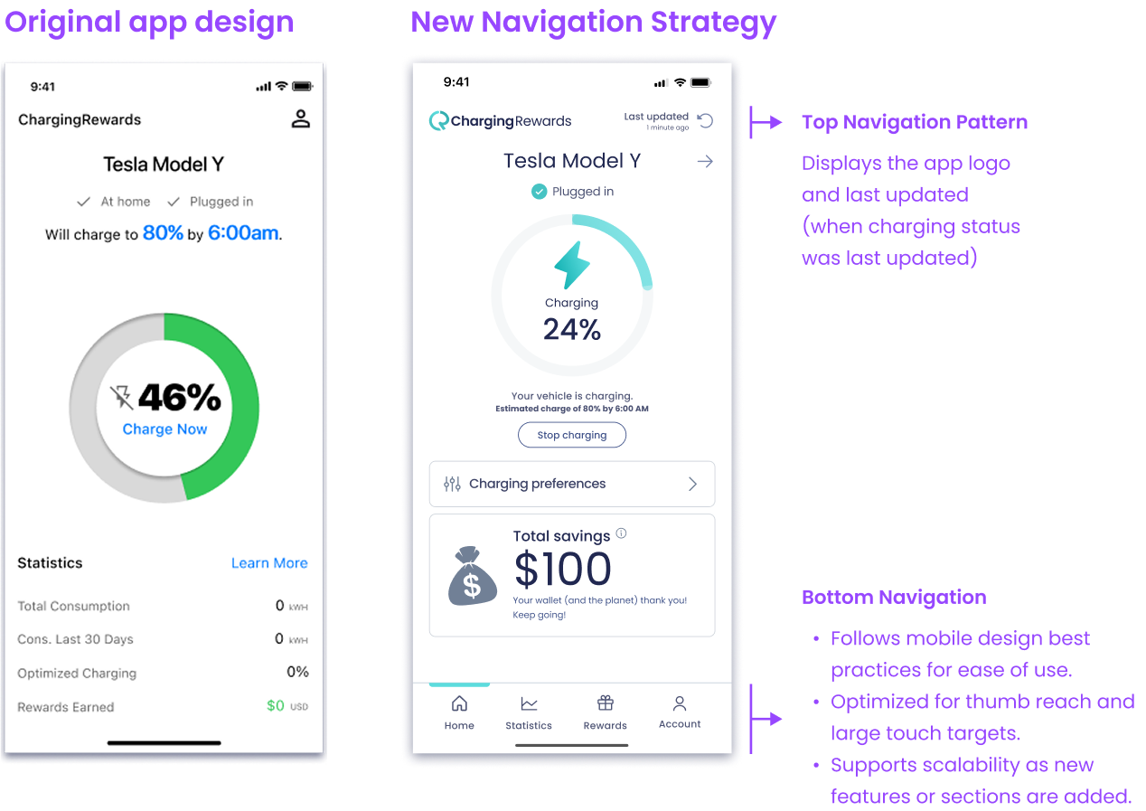
Redesigning the core experience

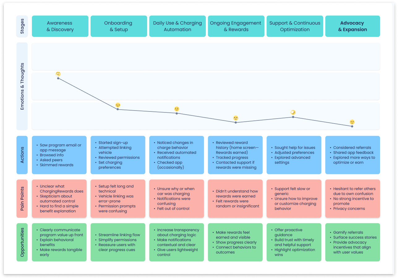
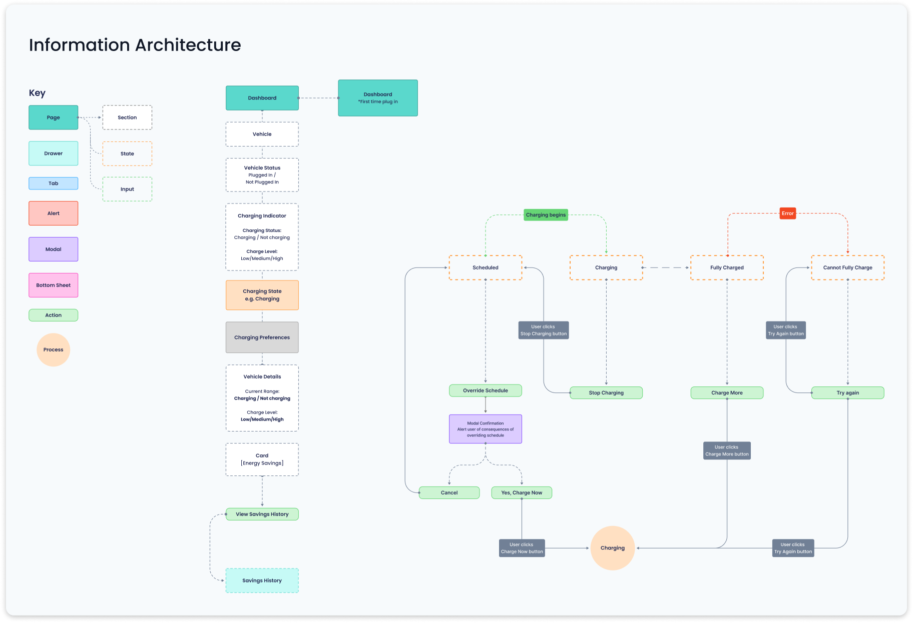
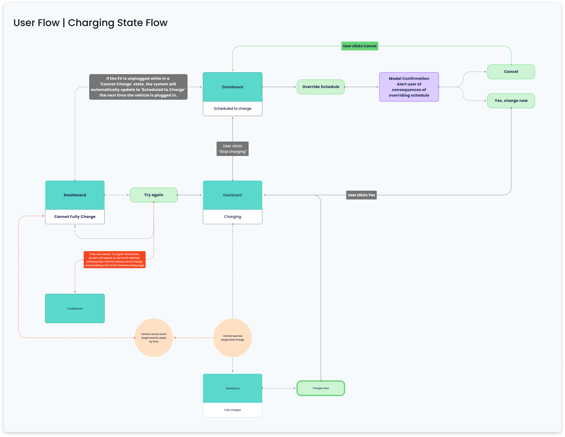
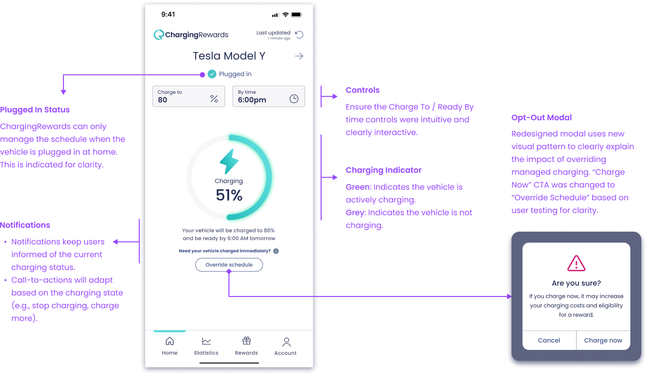
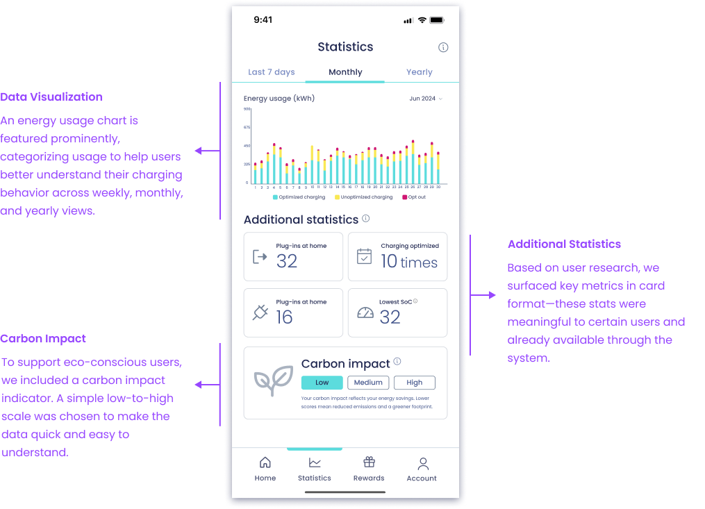
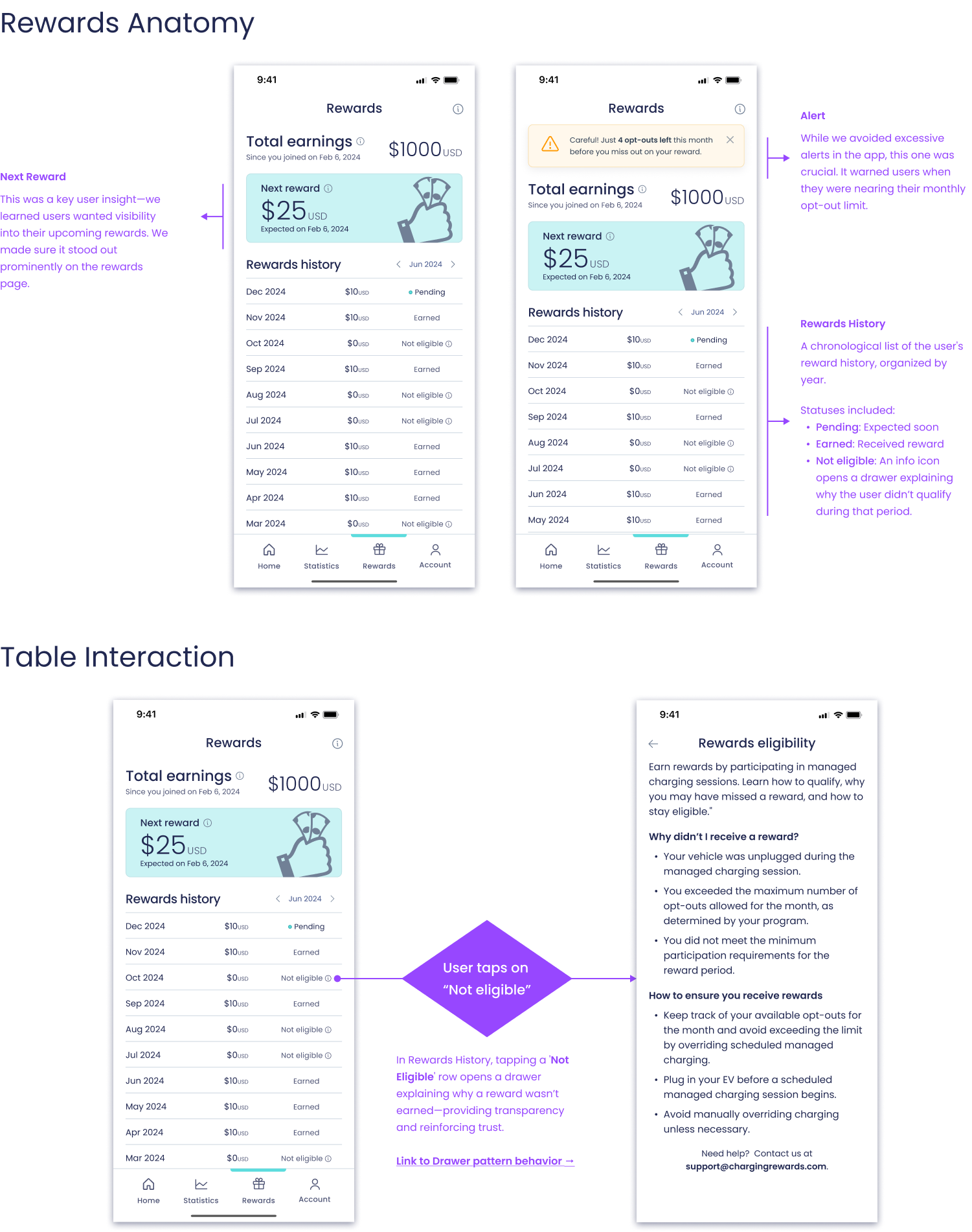
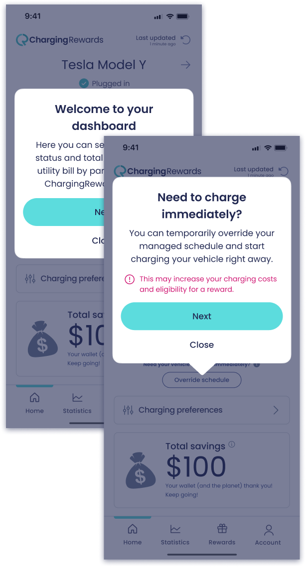
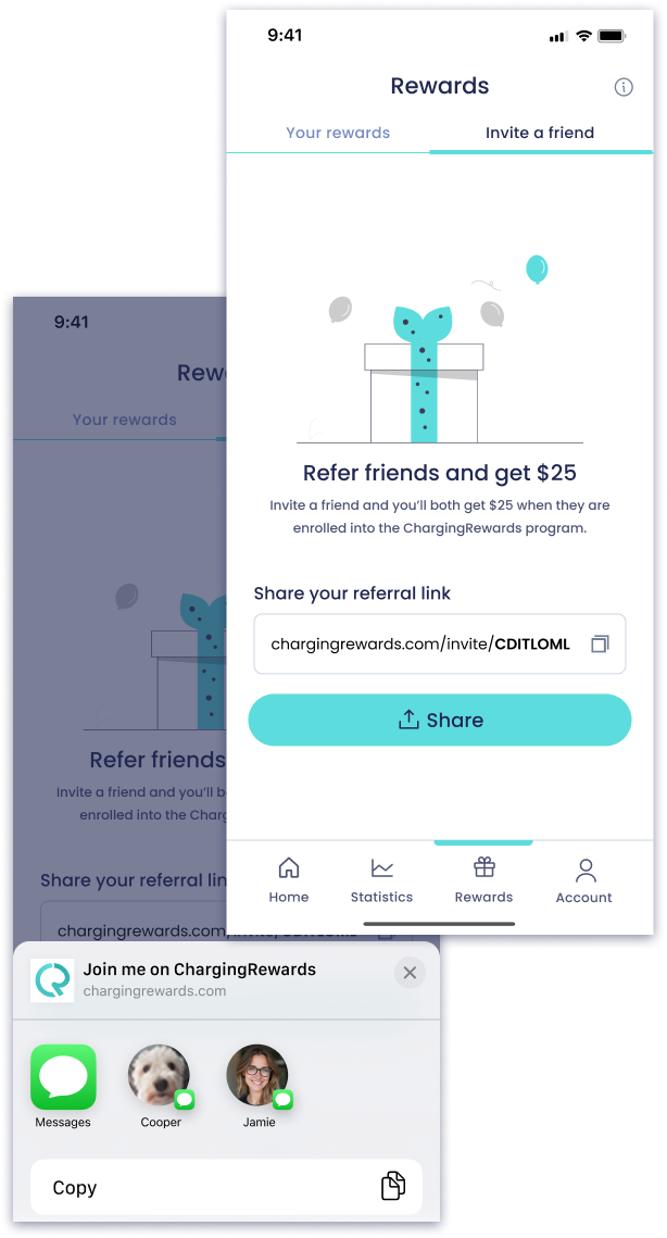
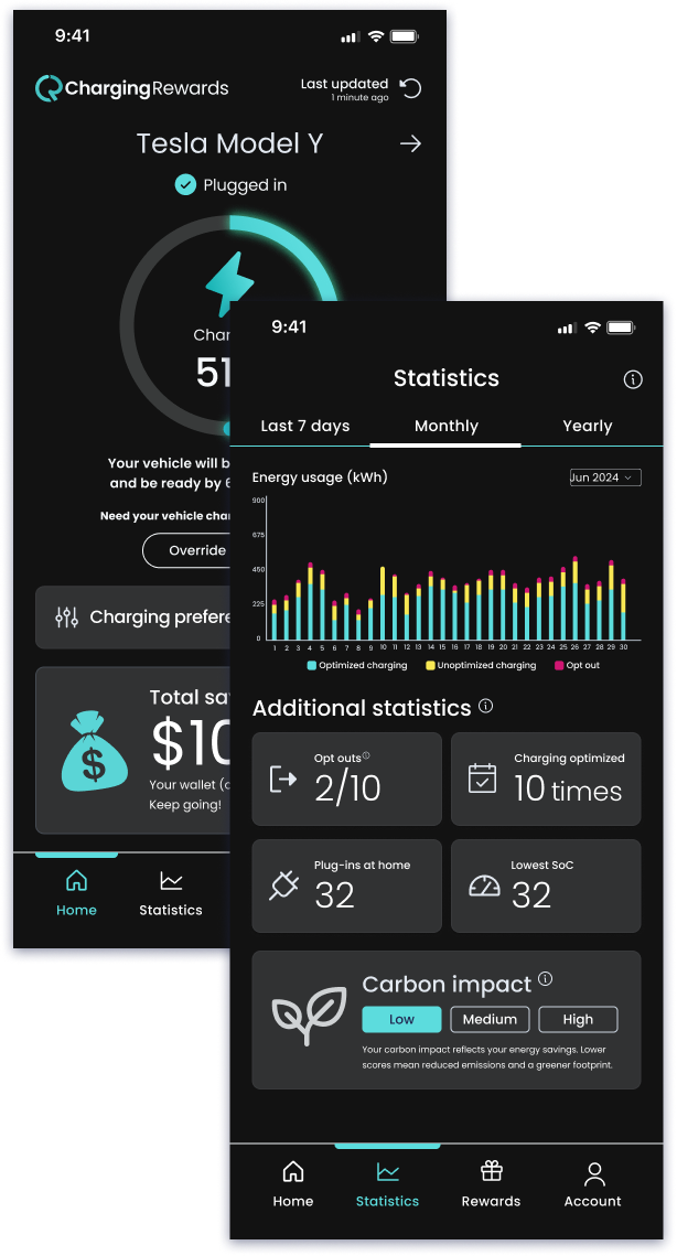
With the most immediate trust gaps addressed, I shifted focus to redesigning the core product—anchoring it around four key behavioral pillars. The new Dashboard provided clarity on charging state and status. Schedule Control empowered users to adjust their charging preferences safely. Statistics combined energy usage trends, carbon impact, and historical charging behavior to reinforce confidence through transparent, user-prioritized data. And Rewards made benefits tangible, trackable, and motivating.

Design reviews and usability testing sessions helped validate decisions and ensure the work stayed grounded in real user needs..

Dashboard anatomy highlighting clearer charge state indicators, a reworded 'Override Schedule' CTA, and a new modal design—part of a scalable system that improved clarity and reduced opt-out confusion. Subtle motion was added to reinforce active charging.

Dashboard

The redesigned dashboard emphasizes clarity, confidence, and consistency. Clearer icons, refined copy, and contextual notifications help users understand their charging state at a glance. A new confirmation modal for "Override Schedule" reinforces the tradeoffs of opting out, using our updated visual system and language. These changes, informed by user feedback, contributed to stronger comprehension and trust.

Dashboard anatomy highlighting clearer charge state indicators, a reworded 'Override Schedule' CTA, and a new modal design—part of a scalable system that improved clarity and reduced opt-out confusion. Subtle motion was added to reinforce active charging.

Statistics

The Statistics screen helps users make sense of their charging behavior over time, with an energy usage chart spanning weekly, monthly, and yearly views. Key metrics are presented in a clean card layout—prioritized based on what users told us they cared about most.

For the carbon impact indicator, I opted for a simple low/medium/high scale over a more complex gauge visualization which tested better for clarity during usability testing sessions. This choice reduced visual noise and made the data easier to interpret, staying true to the product’s focus on clarity.

Statistics screen anatomy showing historical energy usage, user-prioritized metrics, and a simplified carbon impact indicator—all designed for quick insights and ease of interpretation.
Rewards screen anatomy, featuring a prominent “Next Reward” card, opt-out warning alert, and an interactive rewards table. Tapping on a “Not eligible” item opens a contextual drawer with clear explanations to keep users informed and engaged.

Rewards

A key user insight was the need for greater visibility into upcoming incentives. To keep motivation high, we made “Next Reward” a focal point on the Rewards screen.

We also introduced a gentle alert to warn users when they’re nearing their monthly opt-out limit—designed to inform without overwhelming.

To improve transparency, the rewards history section clearly labels each reward’s status: pending, claimed, or not eligible. When a reward isn’t earned, users can tap an info icon to open a drawer explaining why—closing the feedback loop and reinforcing trust in the system.

Rewards screen anatomy, featuring a prominent “Next Reward” card, opt-out warning alert, and an interactive rewards table. Tapping on a “Not eligible” item opens a contextual drawer with clear explanations to keep users informed and engaged.

Designing for Impact

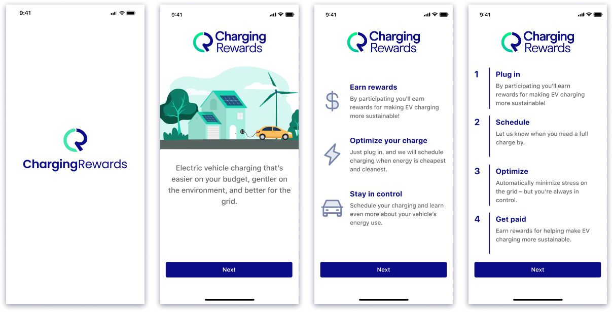
Beyond core screens, I looked for ways to improve the product experience holistically—boosting engagement, reducing confusion, and adding long-term value. These additions weren’t part of the original scope, but I pushed to deliver them because they solved real user problems and aligned with business goals.

Just-in-time walkthrough

After onboarding, users often lacked a clear sense of what to do next. To address this, I designed just-in-time walkthroughs—lightweight, contextual prompts triggered by key events like logging in for the first time, earning a reward, or opting out. These cues helped guide users at the right moment, reducing confusion, lowering support tickets, and building early confidence—without adding clutter to the core experience.

These prompts appear the first time a user logs in after completing onboarding—offering guidance at a key moment without adding friction.
The Invite a Friend feature was integrated directly into the Rewards section—positioned as a referral-based reward. To support this, I updated the screen structure to include tabbed navigation between “Your Rewards” and the new “Invite a Friend” view.

Invite a friend

As the redesign took shape, I proposed a referral flow to support user growth. Drawing from past experience with viral loops, I pitched the idea, aligned it with the product’s tone and visuals, and delivered a developer-ready spec with state logic—before it was even prioritized on the roadmap.

The Invite a Friend feature was integrated directly into the Rewards section—positioned as a referral-based reward. To support this, I updated the screen structure to include tabbed navigation between “Your Rewards” and the new “Invite a Friend” view.

Dark mode

I prioritized theming support early while building the mobile design system—knowing dark mode would improve accessibility and visual comfort for many users. By designing for flexibility from the start, we were able to introduce dark mode later with minimal additional effort.

Dark mode wasn’t just a visual toggle—it was a thoughtful addition to enhance comfort, accessibility, and aesthetic refinement. By building theming into the design system early, I ensured visual consistency across light and dark modes with minimal overhead.

Testing, Iterations & Delivery

Testing

To move quickly, we ran parallel research: moderated sessions via UserZoom and unmoderated flows in Maze.

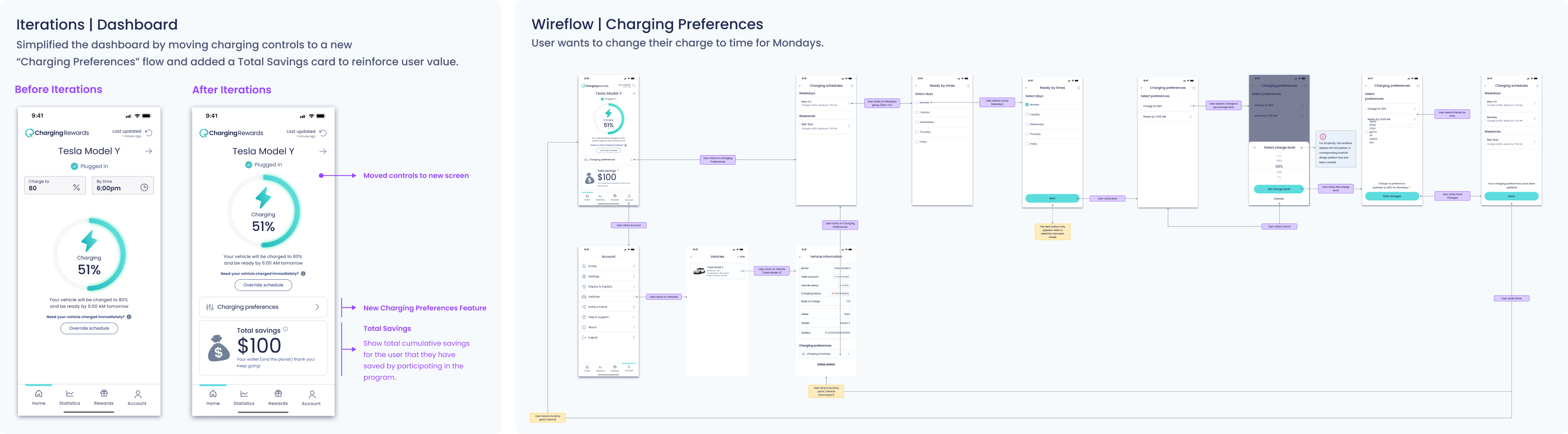
One key insight: users rarely adjusted “Charge To” or “Ready By” parameters—they valued flexibility, but without friction. I moved these into a dedicated Preferences flow, simplifying the dashboard and aligning with user mental models.

Iterations

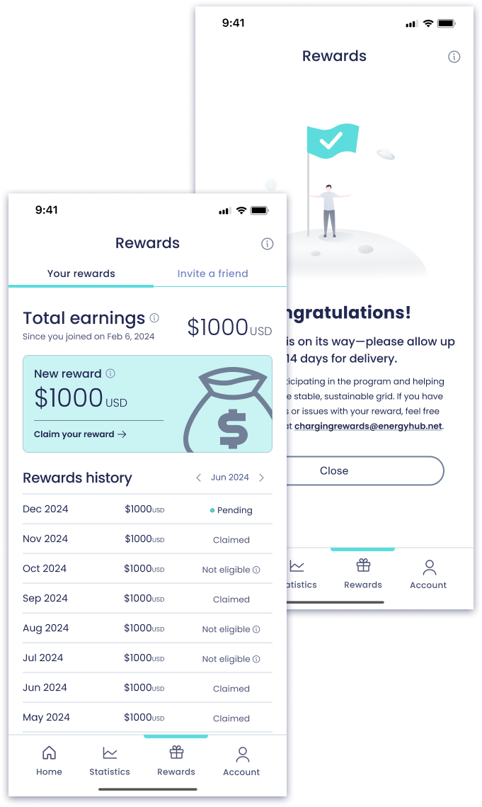
I refined the Dashboard to include a “Total Savings” card—giving users a clear sense of financial value earned.

Also redesigned Charging Preferences to be more focused, flexible, and easier to maintain. Throughout, I supported engineering with annotated wireframes and system-behavior wireflows, reducing ambiguity and speeding up handoff.

Delivery

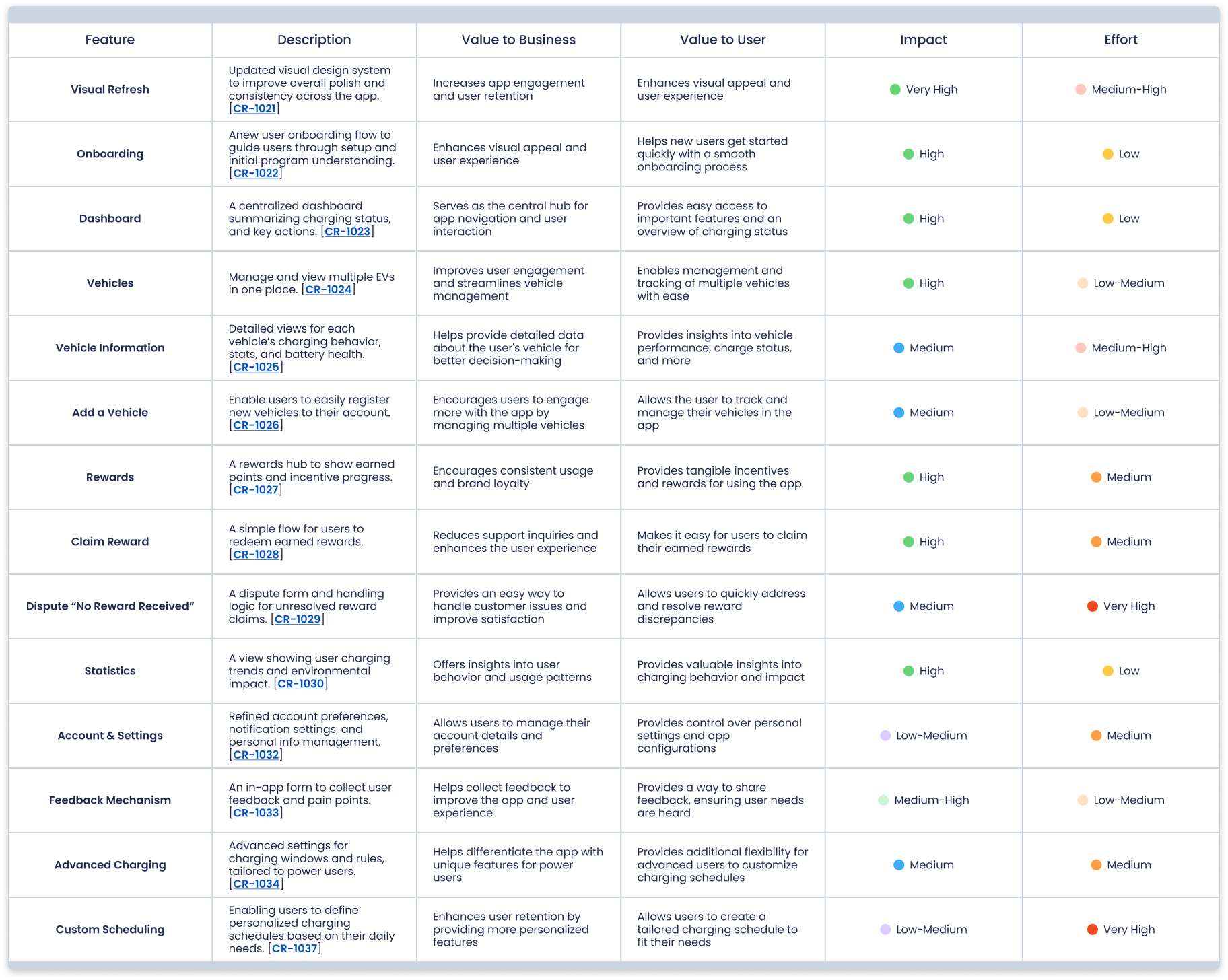
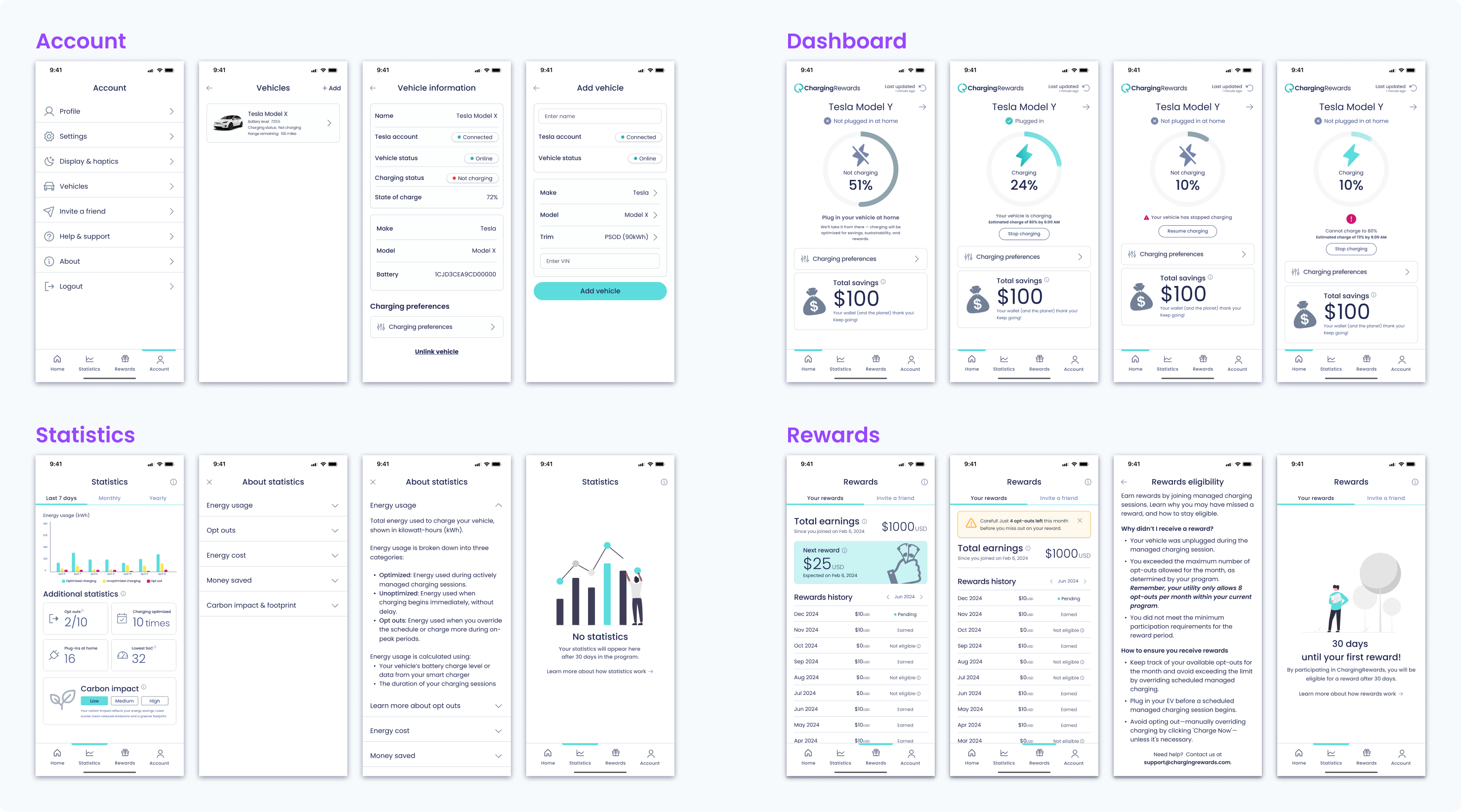
These represent just a subset of the final designs delivered across the product. I designed for every core screen, edge case, and system state—ensuring consistency, clarity, and scalability across the experience.

What’s shown here includes key states for Account, Dashboard, Statistics, and Rewards—as well as patterns like drawers, empty states, and dynamic charging feedback.

Outcome

"Claim a Reward” feature, fully designed and validated but paused due to utility constraints. I scoped the experience end-to-end—UI, logic, and edge cases—tested it with users, and laid the groundwork for future implementation once redemptions are supported.

Results, tradeoffs & takeaways

The beta launch saw a 46% drop in opt-outs and an average user trust rating of 4.7/5, signaling strong gains in engagement and confidence. Qualitative feedback echoed this—users felt more clarity and comfort in their charging experience. While we designed and validated a “Claim Reward” feature, we ultimately paused its release due to utility-side limitations. This decision reflected a broader theme: making strategic trade-offs to balance innovation with delivery speed.

"Claim a Reward” feature, fully designed and validated but paused due to utility constraints. I scoped the experience end-to-end—UI, logic, and edge cases—tested it with users, and laid the groundwork for future implementation once redemptions are supported.

Conclusion

ChargingRewards was a masterclass in solving complex, real-world problems with scrappy, research-driven design. By aligning business needs with user trust and motivation, we created a scalable product that supports critical infrastructure and rewards drivers. This project sharpened my leadership in fast-paced, resource-constrained environments, deepened my strategic design thinking, and underscored the power of user trust in driving product success.